Multi-panel Navigation in Fibery
When working in Fibery, we regularly juggle several things at once. Here is a typical workflow:
- Outline a feature spec.
- Check out linked feedback.
- Elaborate on the feature spec.
- Create a new sub-feature.
- Describe the sub-feature.
Before 🌵
Navigating through this workflow in Fibery has been like kissing a cactus:
- Outline a feature spec.
- (wow, new screen, what was the question again?)
- Check out linked feedback.
- Elaborate on the feature spec.
- Create a new sub-feature.
- (oh, forgot to update the feature — go back)
- Describe the sub-feature.
Cognitive load because of ever-changing context is unnecessarily high.
After 🍅
With panels the cactus turns into a tomato:
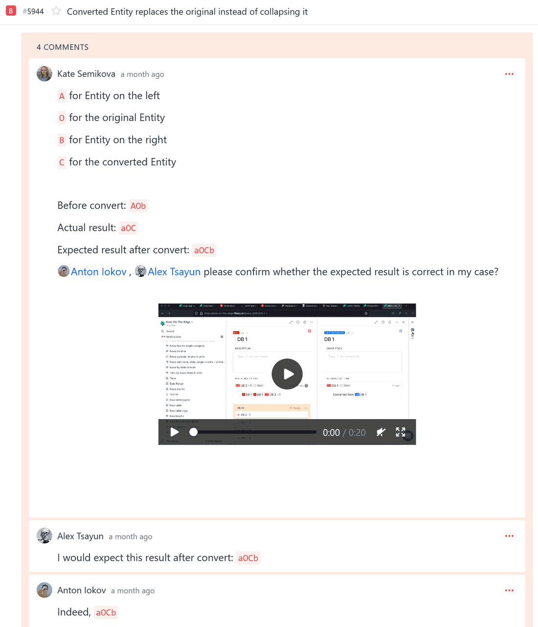
While there are straightforward practical benefits, the idea behind the multi-panel navigation lies deeper. With bi-directional links, the new navigation, and future Blocks we are making a tool that encourages questions:
- why are we doing this thing?
- what customers are we trying to make happier?
- have we done anything similar before?
The navigation reduces the friction to explore — our ideal user is a curious one.
Inspired by
We are influenced, among others, by Andy Matuschak and Szymon Kaliski as well as Obsidian and Innos.
However, unlike these tools for thought, Fibery holds structured relations. This means we can derive meaning from links and open panels differently depending on the context:
⬅️ going back to the source of knowledge: ex. many-to-one relation, back-reference.
➡️ digging deeper: ex. to-many relation, entity mentioned in rich text.
Left-right behavior is still an experiment though: maybe, predictability for an average user turns out to be more important — and we’ll always open new panels on the right.
Feedback wanted
In line with our dogfooding tradition, we’ve been using the multi-panel navigation within our team for a month before today’s release and the feedback has been suspiciously positive:
Now that I'm used to our multi-panel navigation, Notion drives me crazy without it.Also, we announced the panels as an experimental feature and a few customers have been brave enough to enable it. This might be their real feedback or a product of some kind neural network:
Love the multi-panel navigation 😍 It's much faster for me now to navigate into things, and it's especially useful with the snappy navigation back and forth between collapsed panels on left and right side!Re: Multi Panel - It great, zero desire to go back to the old way! When starting at the view level, it would be nice to support having that in the panel, so it's fast to toggle between an entity and a view.the multi-panel is absolutely amazing and we can now work in fibery with 1 tab open instead of several! now if we could minimize tabs to get back to later, we'd have perfection. But even as is, it's an amazing improvement, love it!While positive feedback is great, we admire honesty even more than kindness. Please send us your impressions via Intercom or community:
- which workflows have we screwed up?
- are there any other screens you wish to be included in the panel navigation?
- are you still using 13” laptop as your primary machine and haven’t noticed any changes?
If you really hate the change, please feel free to disable the multi-panel navigation via experimental features while we are improving it.
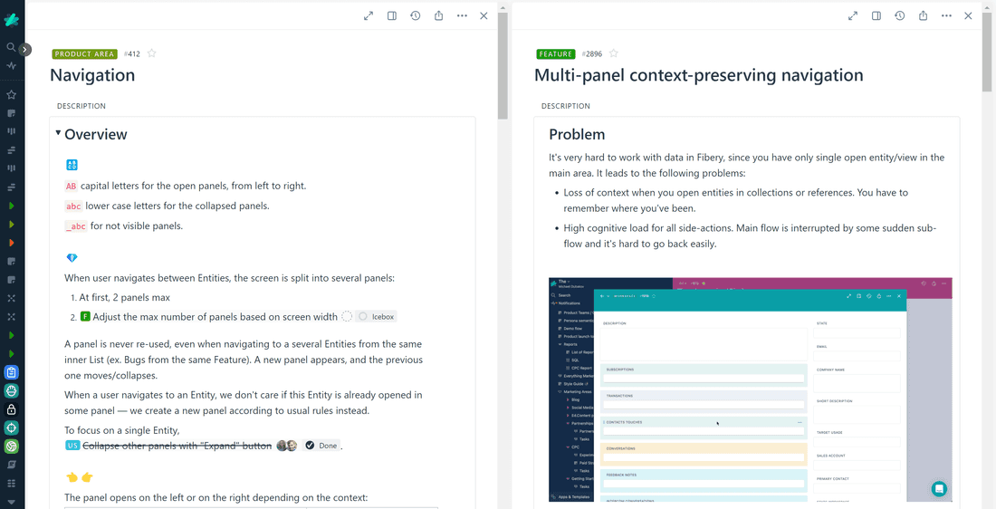
Bonus: panel notation
Since it’s pretty hard to describe the panels behavior in a concise and clear manner, we had to get creative:
- AB capital letters for the open panels, from left to right.
- abc lower case letters for the collapsed panels.
- _abc for not visible panels.
Psst... Wanna try Fibery? 👀
Infinitely flexible product discovery & development platform.