Fibery Documents Improvements in 2023
This year, we focused on documents in Fibery and greatly improved them. You might still miss some things, but overall, documents and rich edit fields are quite powerful in Fibery now.
In this post, I will briefly show all the improvements we made and how we use them ourselves at the Fibery team. In general, we tend to implement features we need ourselves 🍖🐕, so our use cases may spark some ideas about how to use documents as dashboards, interactive reports, or a better wiki.
Nested documents (instead of folders)
Nested documents are essential for any wiki and people got used to them. We advised to use Folders in Fibery instead in the past, but nested docs are just more natural. For example, you can’t give a link to a folder and can’t mention a folder in docs.
We already use nested documents in many areas. Here we collected all important things from our offline company retreat and put them into a single nested document. It was easier to handle it this way, since I just sent this single doc to a team and asked to add nested documents for every significant session we had.
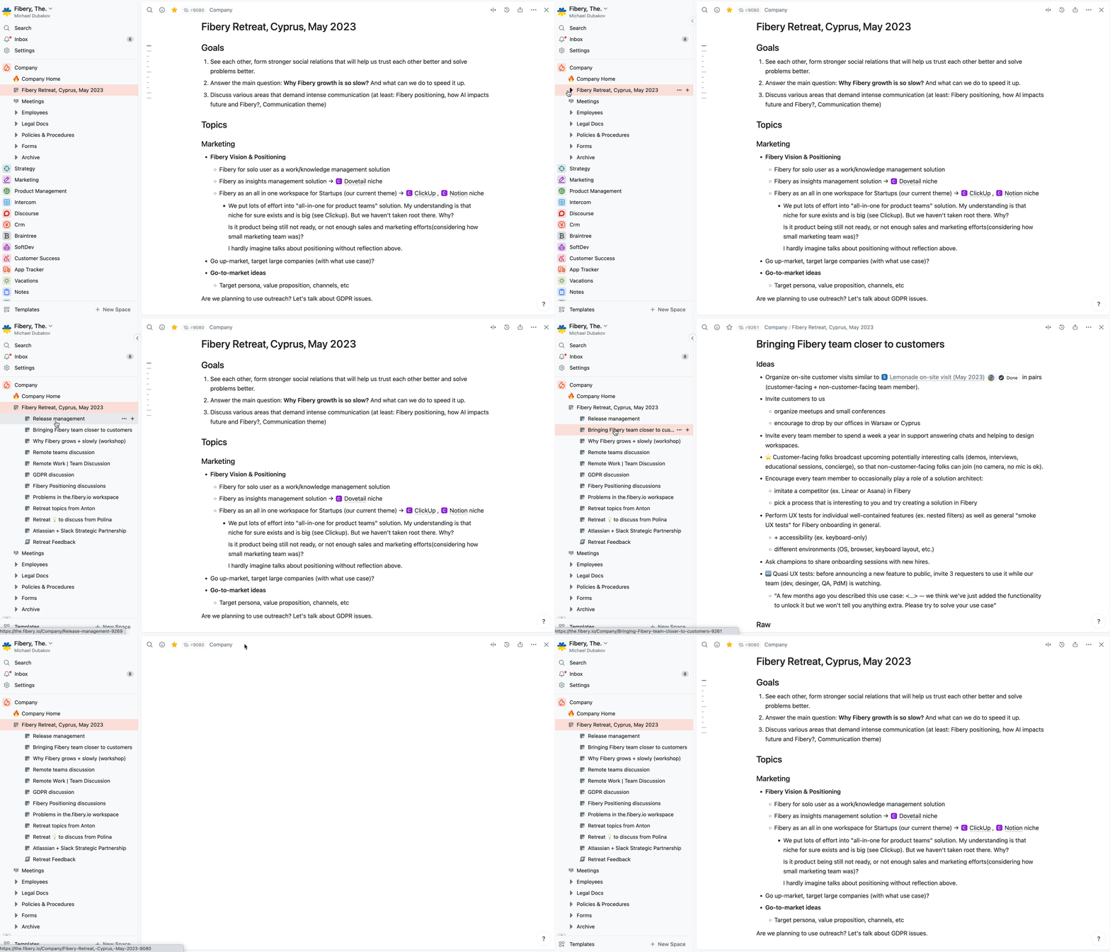
Nested documents to accumulate info from several groups at Fibery retreat.
We also added many small things that help to work with docs:
- Create a nested document via /Document command.
- Breadcrumbs help to navigate between nested levels.
- Find documents faster, since there is a filter for only documents in search results.
- See all back references in a document.
Emojis and icons (instead of standard icons)
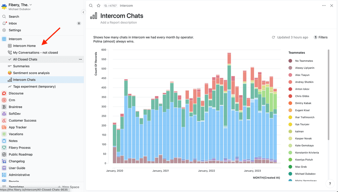
All documents in Fibery had same standard icon 📄. It was quite boring, to be honest. Now you can add emojis and icons to documents to make them more catchy.
This is our Intercom space where we gather and manage all feedback from Intercom chats. The Intercom Home document has a custom Icon, making it easier to identify and reference. Icons and emojis offer immediate context, helping you navigate and understand what to click.
Well, and it just looks better.
Views inside documents
Documents in Fibery were quite static, it was possible to write text, insert images, and add references to some entities. Now you can insert Views and transform documents into dynamic dashboards or interactive reports.
We have such dashboards in every space now: Company, Product, Marketing, etc. Views are resizable, so you can keep text narrow and pleasant to read, while making View wide and pleasant to explore.
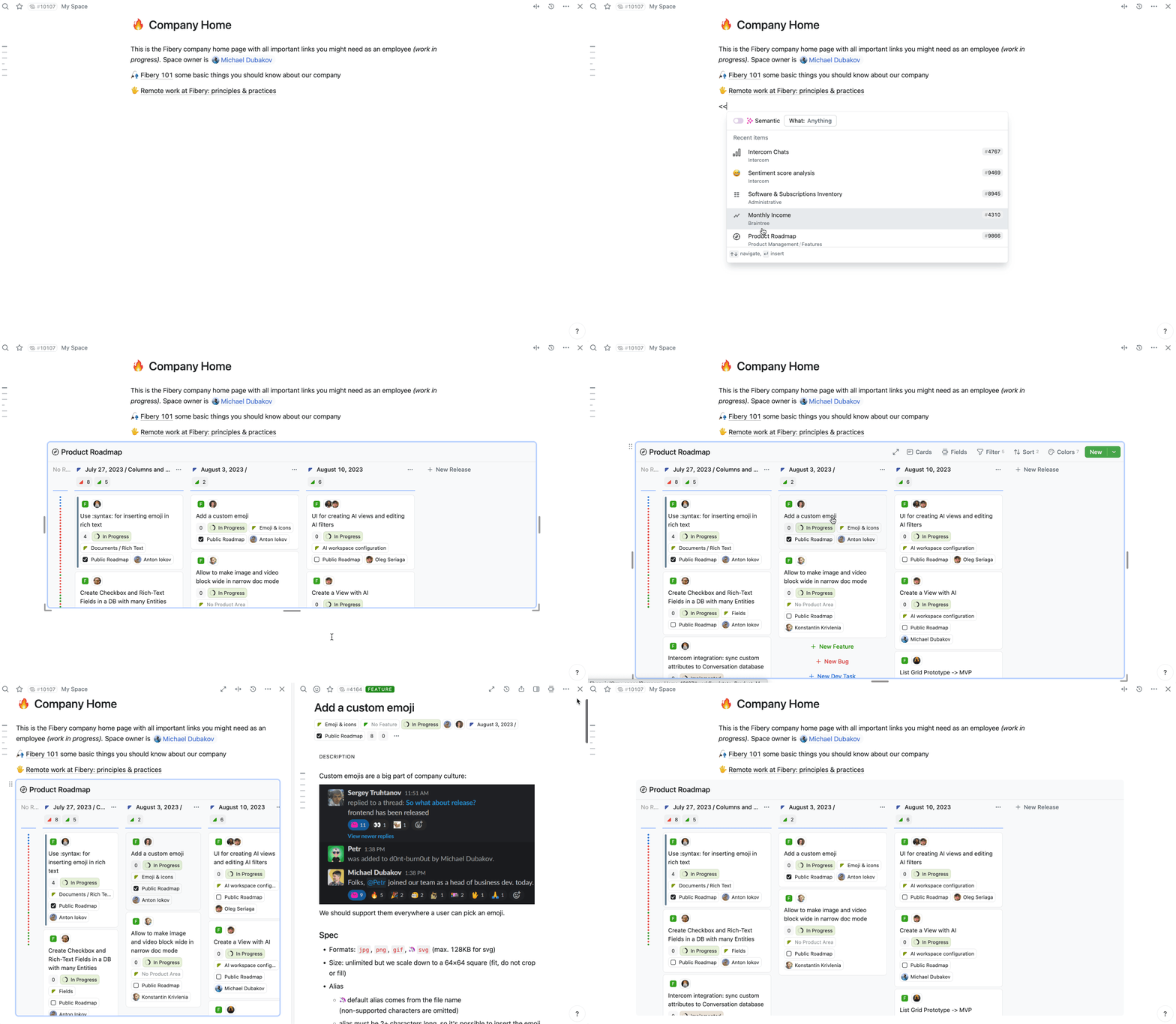
Insert a View into any document and make it look good.
🦔 Views inside Documents user guide.
Columns PageLayout powers dashboards
Dashboards look weird if you have only one column, and the next natural step for us was to add multi-columns layout to documents. With multiple columns, you can present information in a condensed manner, making the document feel like a true dashboard.
For example, here is our Company dashboard that contains all important information about all areas of our small business.
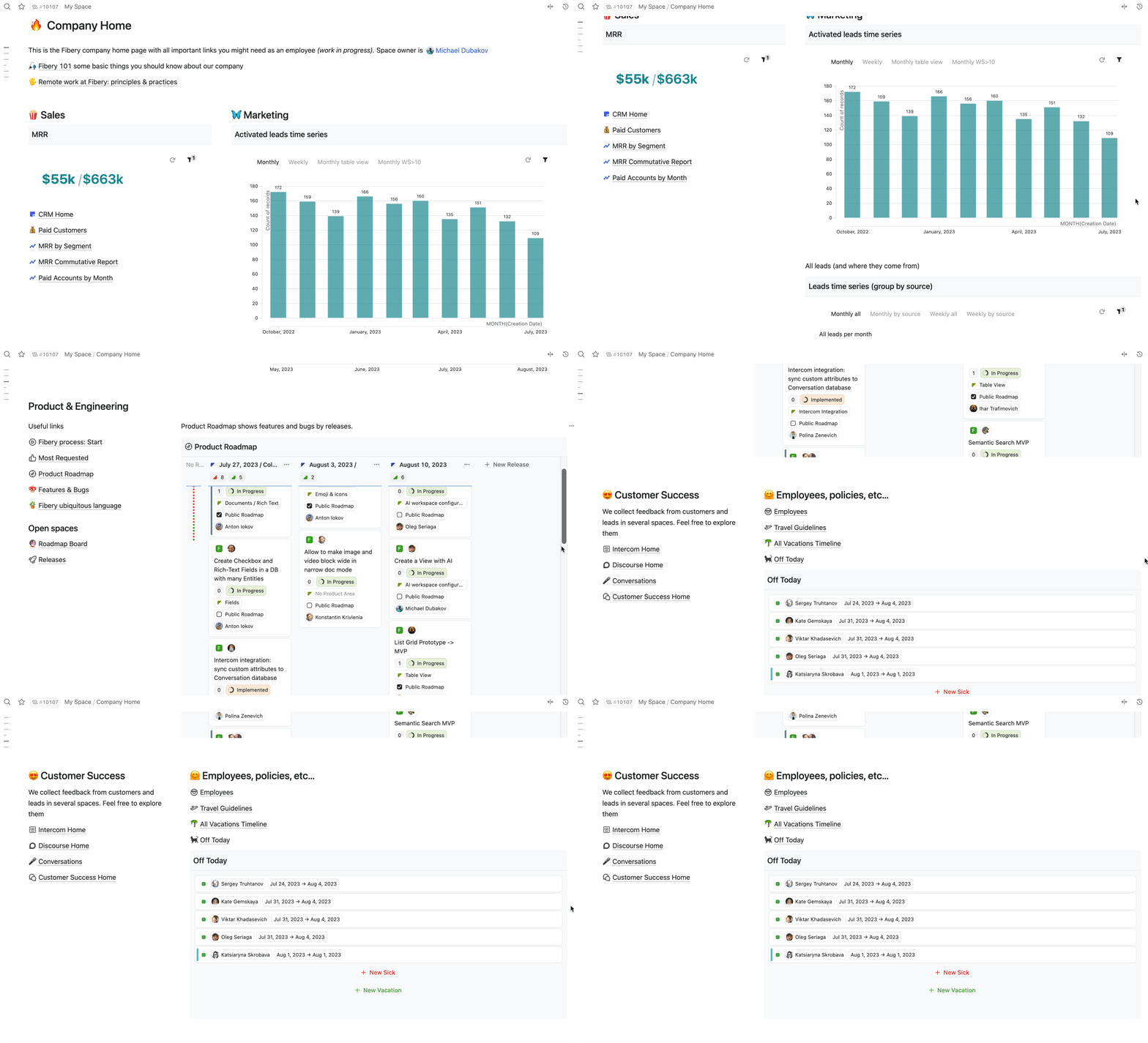
Dashboards are impossible without columns.
Callout block
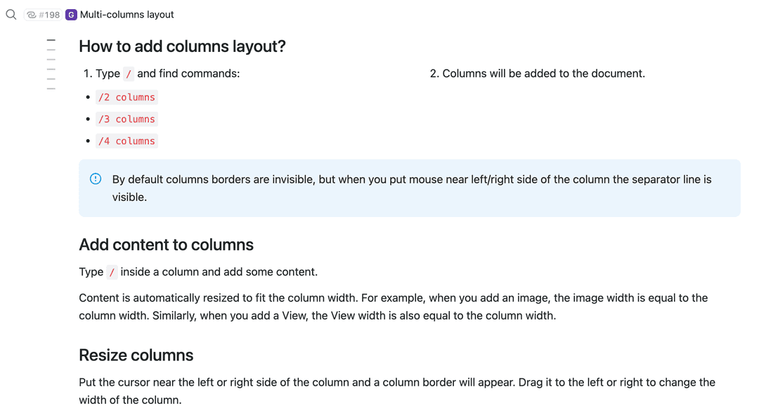
Callouts are a great way to draw attention to specific parts of text, such as notes, warnings, or important information. I have personally added over 300 callout blocks to our user guide when we implemented this feature, and I find it incredibly useful. It has greatly improved the readability of our documents, allowing readers to quickly grasp important information.
File block
In some processes you have to add many files to documents. Finally, you can do it with Fibery. To be honest, I don’t use this feature much, while some of our customers do.
Table of Content
The Table of Contents helps navigate large documents. I use this feature daily. The Table of Contents is generated automatically based on headers.
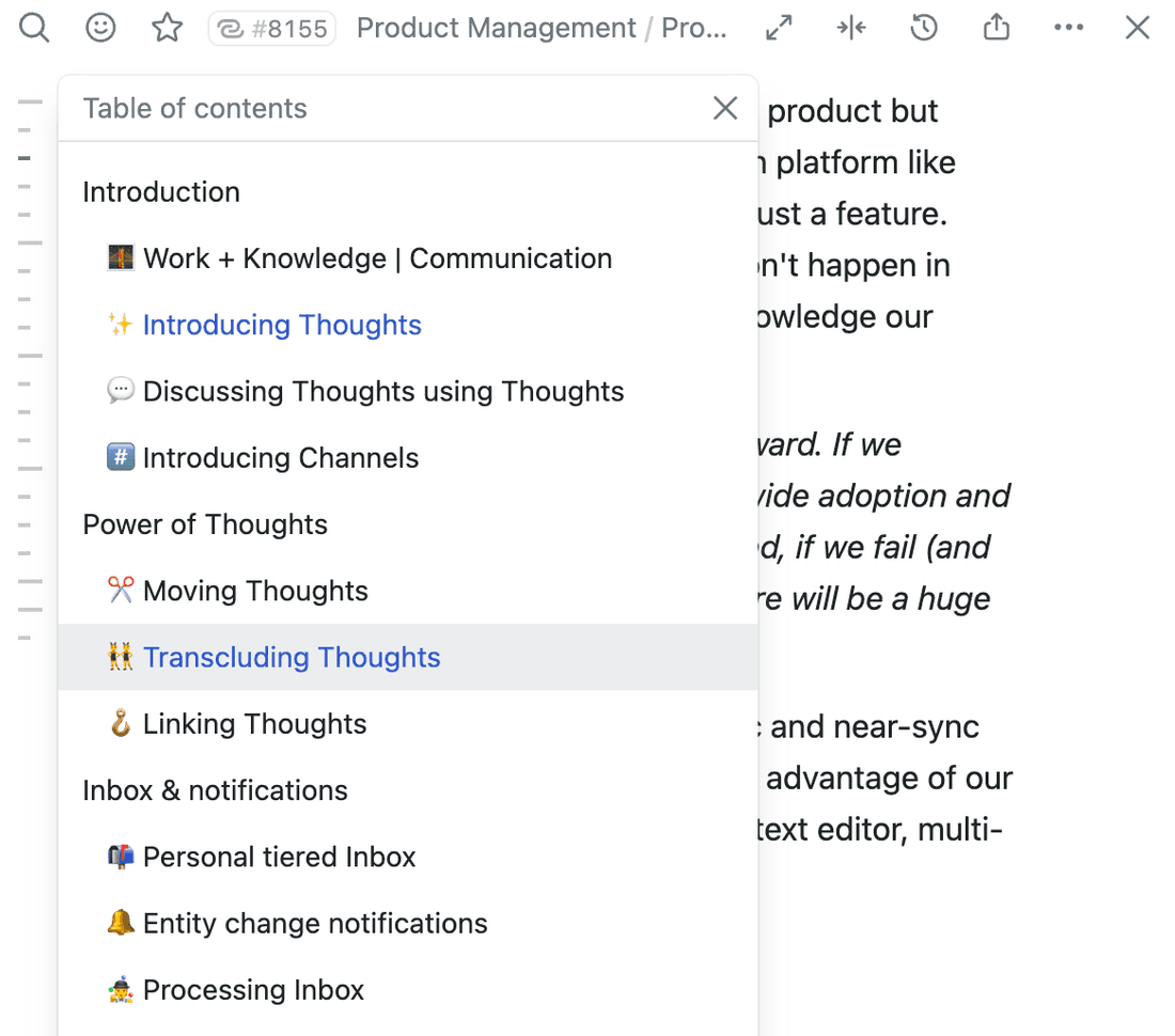
🦔 Table of content user guide.
AI Assistant makes some tools obsolete
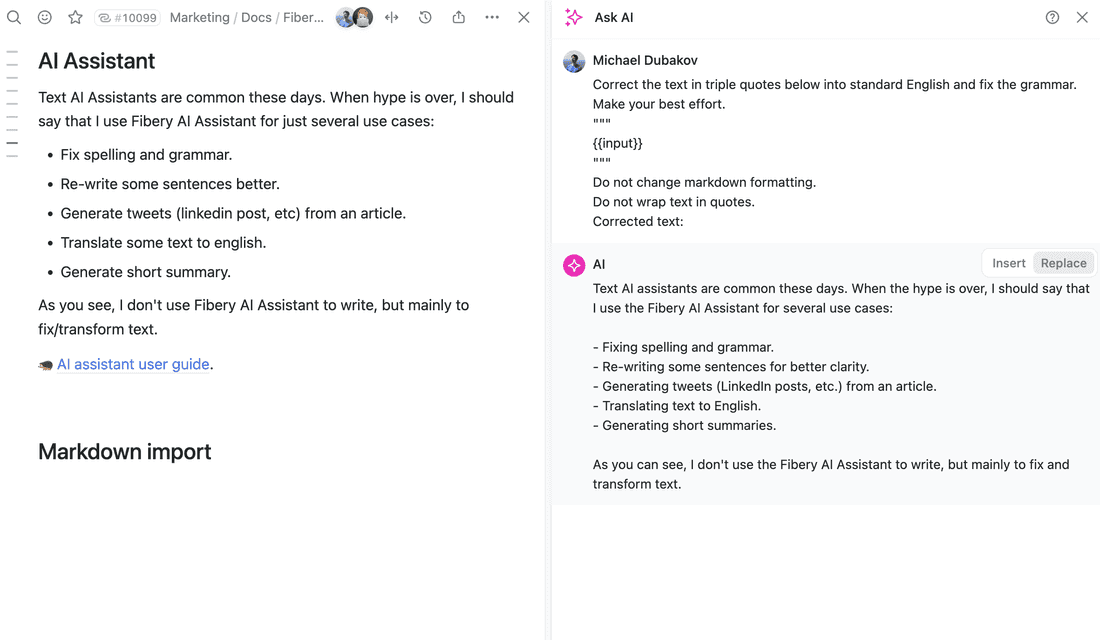
Text AI assistants are common these days. When the hype is over, I should say that I use the Fibery AI Assistant for several use cases:
- Fixing spelling and grammar.
- Re-writing some sentences for better clarity.
- Generating tweets (LinkedIn posts, etc.) from an article.
- Translating text to English.
- Generating short summaries.
As you can see, I don’t use the Fibery AI Assistant to write, but mainly to fix and transform text.
Markdown import
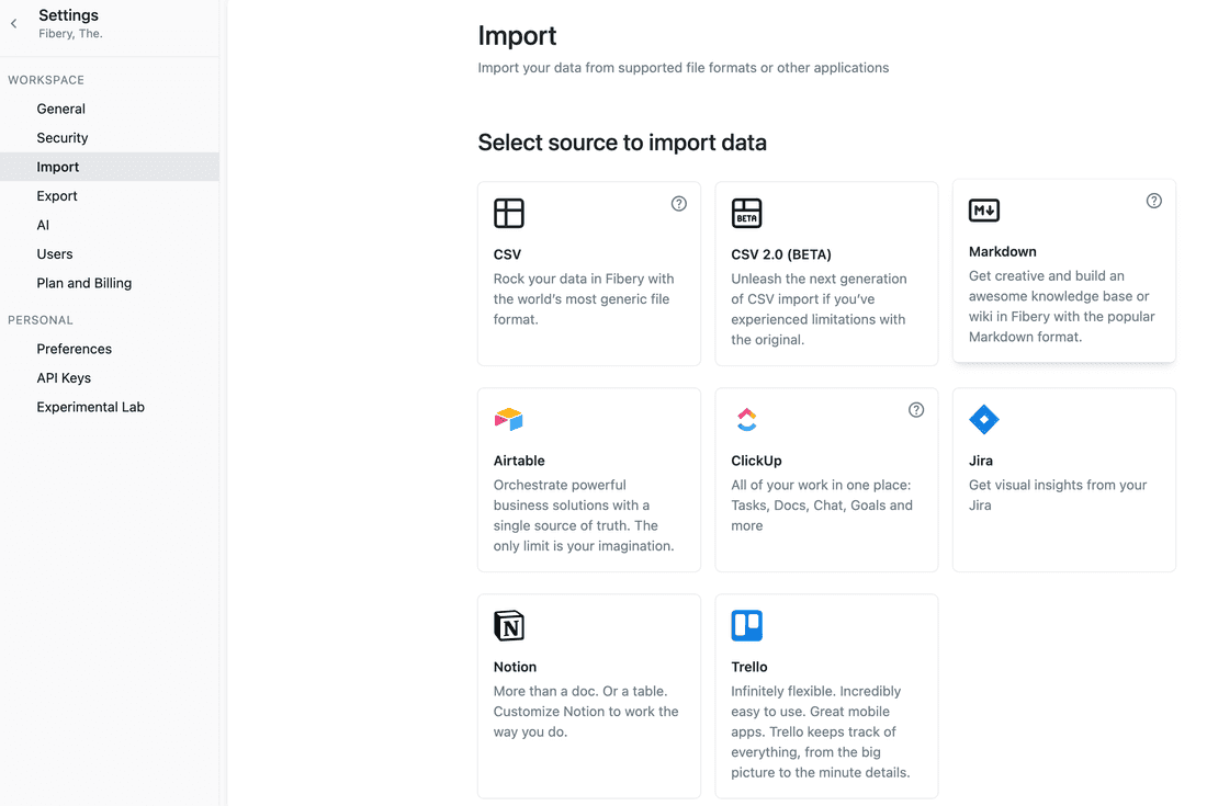
Finally, we’ve added markdown import. You can download Notion documents as an archive and easily import them into Fibery.
I don’t use this feature, since I just use Fibery to write, but you might use it if you decide to give Fibery a try 😉.
Summary
Why do I need all of this when I have Notion? you may wonder. I agree with you. If you only require cool documents, then Notion is still the superior choice. However, if you are looking to manage complex processes, such as product development, then Fibery is the better option.
I hope you got some fresh ideas how to apply new features to make your documents in Fibery better. If you still miss something in Fibery documents, let us know.
Psst... Wanna try Fibery? 👀
Infinitely flexible product discovery & development platform.
