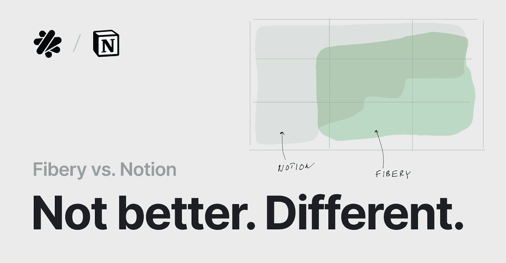
Fibery vs. Notion.
Usually, posts X vs. Y are shallow. This post is not. As the Fibery CEO, I have to switch off the bias. Take this post with a grain of salt.
The major goal is to explain how Fibery is different and what strengths and weaknesses it has. Notion is an awesome product. However, it’s not perfect. Let’s find out why.
Philosophy
Notion is paper
Almost anything in Notion is a page. Workspace is a page. Folder is a page. Document is a page. Databases live inside pages. A Database is a bunch of pages.
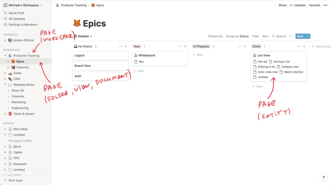
This uniformity is a blessing and a curse. You don’t have to learn complex vocabulary. You just take a new piece of paper and transform it into a text, into a document, into a list of customers, into a meetings calendar, into a gallery of app mockups. It’s not a completely free canvas where you can draw, but you have to restrict freedom somewhere to reduce complexity. Notion has found a great balance between freedom and complexity.
It’s a curse, since some concepts just can’t fit a piece of paper. The stark example is databases.
When databases live inside pages, you have troubles connecting them, extracting information from several databases into a single view, building hierarchies of data. It’s impossible to build complex processes in Notion.
Fibery is a set of connected Spaces
The vocabulary is much richer and you have to understand concepts like Space, Database, Field, View and Document.
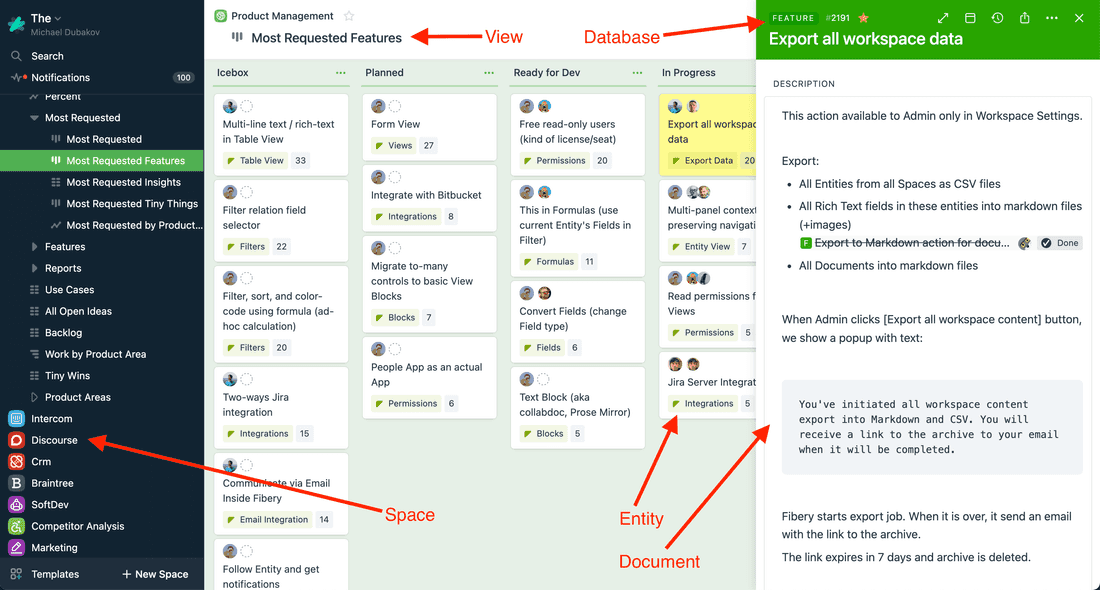
This diversity is a blessing and a curse. You have richer expression power and more powerful medium.
In Fibery you can create spaces with deep hierarchies, connect several processes together, extract information from several databases and replace sophisticated existing tools.
It’s a curse, since entry barrier is higher, there are more moving pieces and you have to learn them all to create something useful. It’s easier to get lost and abandon Fibery. Everything has a cost. With power comes complexity. Fibery hasn’t found a good balance between freedom and complexity yet.
Translation sheet (as close as it can get)

Notion    — Fibery

Workspace — Space
Database  — Database
Property  — Field
Card/Page — Entity
View      — View
Let’s create a workspace/space
We’ll try to create a basic process in both tools. Let’s take a simple Product Tracking process with Epics and Features. Epics are huge requirements that break down to smaller requirements (Features).
As a product gal, you want to write specifications, create product backlog, describe features, plan releases and track execution. Nothing fancy, let’s go.
In Notion I created a Product Tracking workspace and two pages for Epics and Features. Inside this workspace there are two databases: Epics and Features. Epics and Features are connected together via a relation.
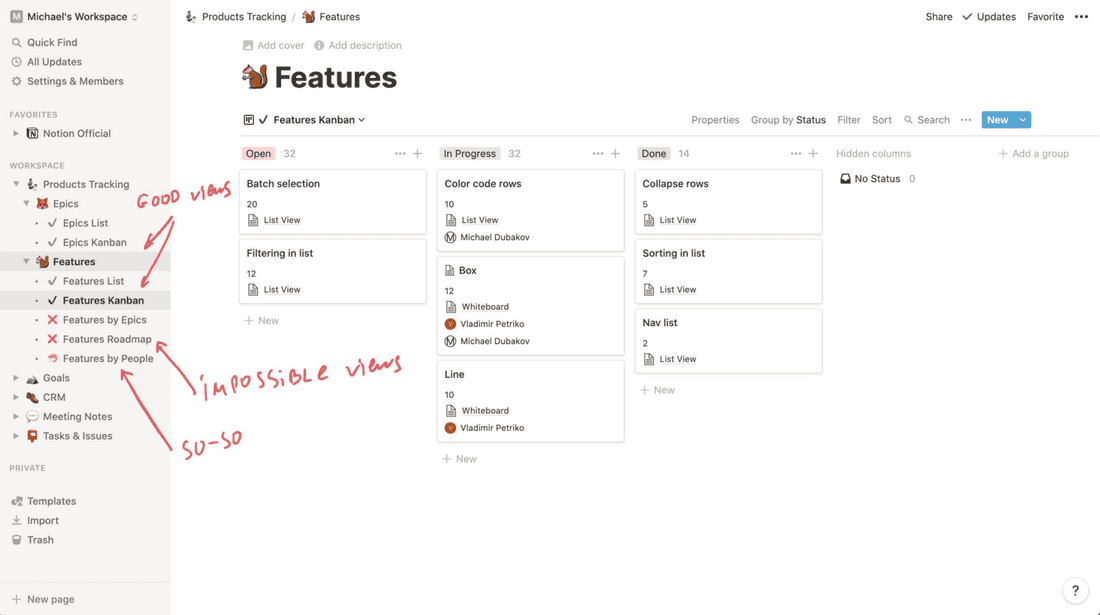
🦐 All is good, but some views are missing:
- I want to see Features by Epics to understand product scope better. Not possible.
- I want to see Features roadmap to plan Features execution. Not possible.
- I want to see Features by People. This is possible on a Board View, but with a serious limitation. I can’t have horizontal lanes in this board…
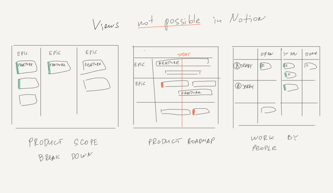
Let’s browse all possible views in Notion:
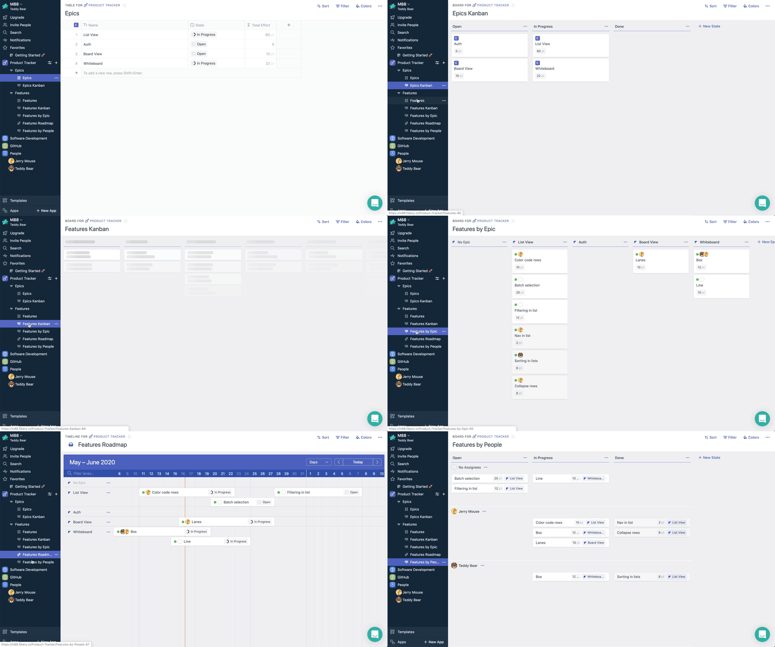
In Fibery I created a Product Tracker space with Epic and Feature Databases. These Databases are connected together via a relation.
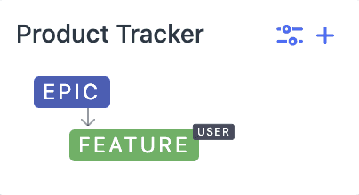
💪 All views are there, without limitations:
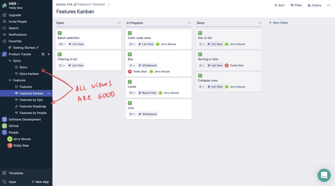
Let’s browse all the views in Fibery:
Epics/Features specification
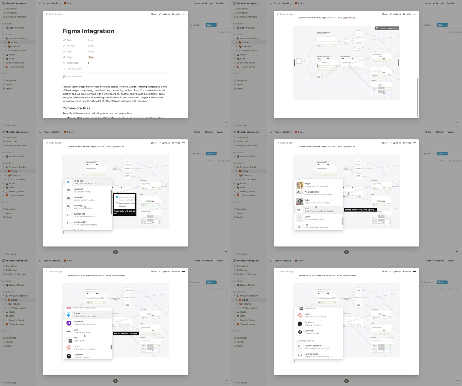
Now I want to create a specification for an Epic. Usually it’s just a document with some images.
💪 In Notion documents are great. You can write text, insert media and embed prototypes from third-party spaces:
In Fibery you can do less. It isn’t possible to have embeds (yet). However, in Fibery you can create mockups right there and link them to your Epics or Features:
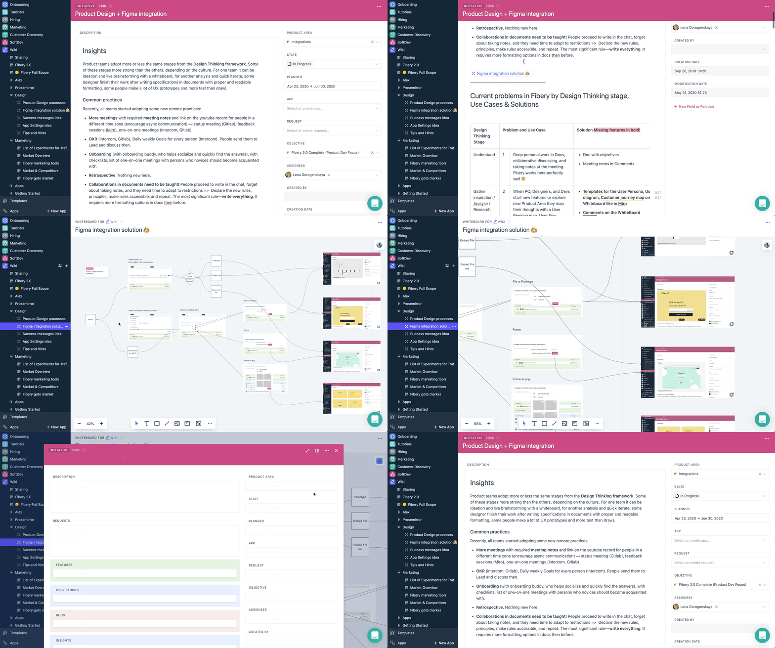
It’s live. You can easily jump to mockup, modify it, jump back to the spec. You can work in specs and mockups collaboratively.
Add Software Development Workspace
OK. let’s dig deeper. You have a software development team. In our days software development teams use Scrum or some other basic iterative process. So we want to split Features to User Stories and plan our Sprints.
🦐 In Notion you have to do it with many workarounds. For example:
There is no way to have Sprint as a separate database, just as a field in a User Story database (otherwise you can’t create a Sprint Board)

→ Thus it will be impossible to have User Stories and Bugs assigned to a Sprint

→ Thus you will have to make some generic Task entity and add a field to differentiate between Bug/User Story.

→ But User Stories and Bugs have some different fields and you will have to live with this redundancy...
There are other problems as well. It will be impossible to calculate Sprint capacity and progress, draw charts with Sprint velocity.
Anyway, this video shows the setup process:
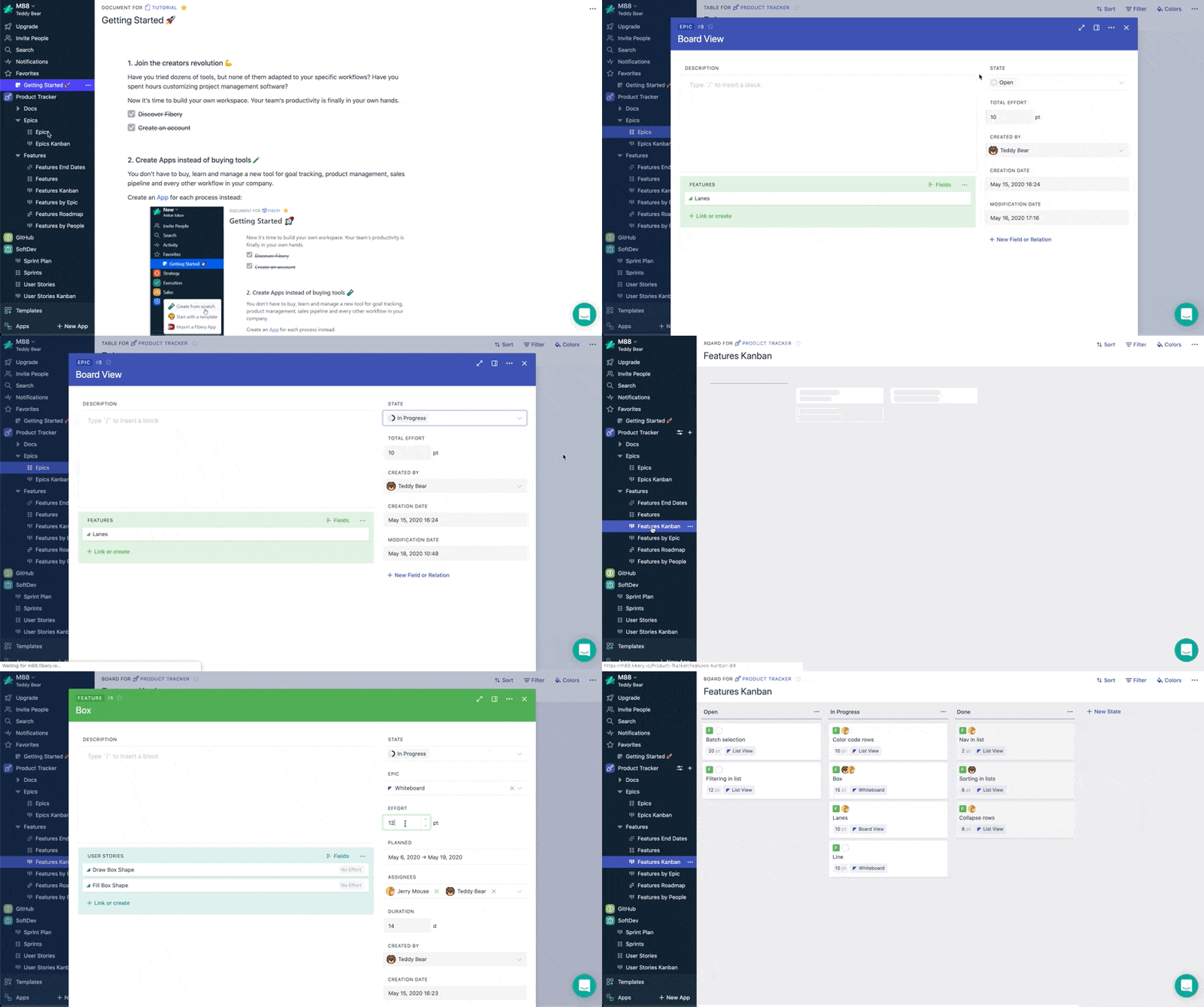
💪 In Fibery connections are smooth. Here are the basics:
Relations
🦐 Relations in Notion are very weak.
Here is an example what you should do to see a list of Tasks inside a Client card (7 steps):
The same instruction for Fibery looks like this (2 steps):
Many things about relations are automatic in Fibery. You have the power of relational database in your hands. You can create views by related entities, traverse deep hierarchies to extract required information. Connect different spaces together. See the whole picture.
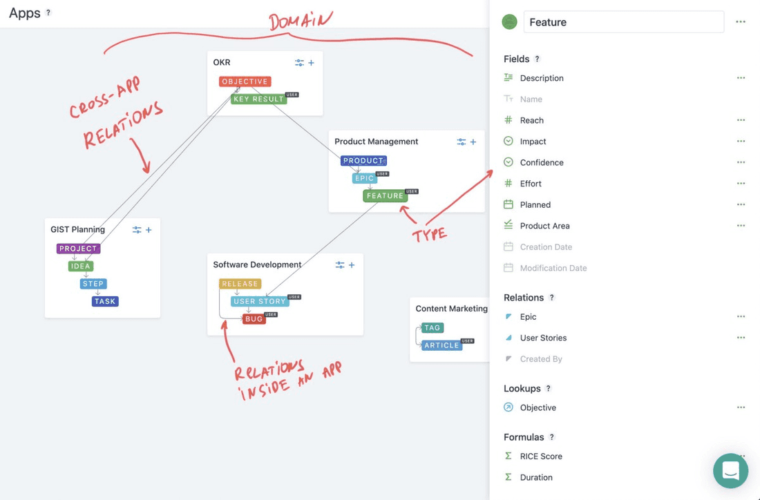
Let’s add some more use cases into the SoftDev space: bugs tracking, people workload and some chart:
Building Blocks
Now we’re ready to decompose both tools to the building blocks. Boring, but an important section. Hold on!
Pages
Remember, almost everything is a page in Notion. This is the most important building block. Many people use Notion just for that: wiki, note taking, knowledge management, documents.
Pages in Notion are pretty advanced. They are block-based, it means everything is a block in Notion and you can move blocks inside pages. Markdown is there. Rich formatting options are there. Many embeds and good layouts are there. Work with text in Notion is fun.
💪 I think Notion is the best wiki on the market right now.
Fibery has no pages. However, every entity can be a page. Fibery has a rich edit field that you can insert into any entity and fill it with text, images, links to other entities, etc. You can create a connected knowledge base in Fibery.
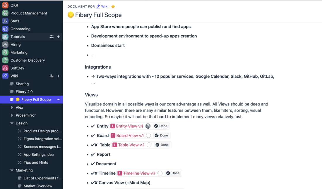
This spec above is a good example how you can connect real work into documents. You see a list of initiatives and all of them are already done. This is how you can create live and follow progress from a single place.
Databases, Relations, Fields and Formulas
This is where Fibery shines. You can create powerful connected databases.
Databases & Relations
💪 Relations between databases are enormously better in Fibery. You can create pretty advanced hierarchies and connect several spaces together:
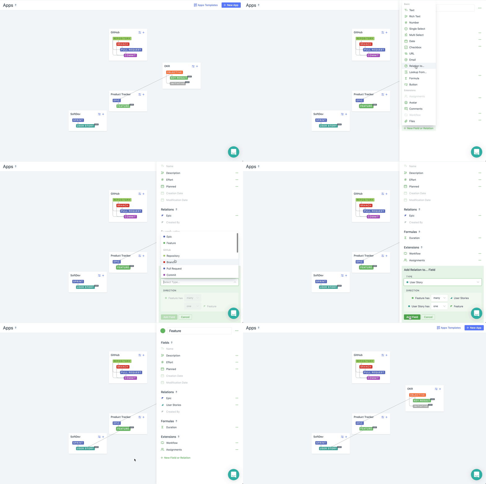
🦐 In Notion you just can’t do it.
- No deep hierarchies
- No domain overview
- No relation direction (all relations are many-to-many by default)
- No way to extract all entities from several databases in a single screen.
- …
Fields
In both tools fields/properties are almost identical. You have text, single/multi select, checkbox, number, email, date, etc.
In Notion you can easily change field type on the fly, in Fibery it’s not possible, so you have to think more carefully when adding a field.
Formulas
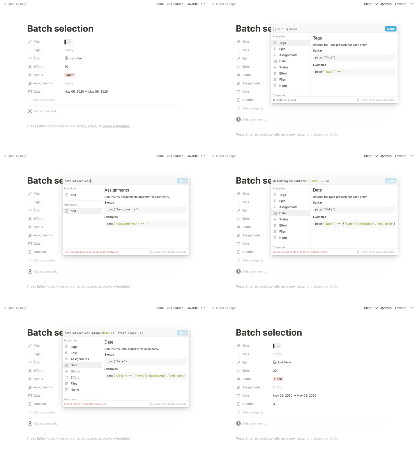
Notion formulas are good. However, formula editor does not have an autocomplete, so you have to type quite many things and the formula creation process is kinda slow:
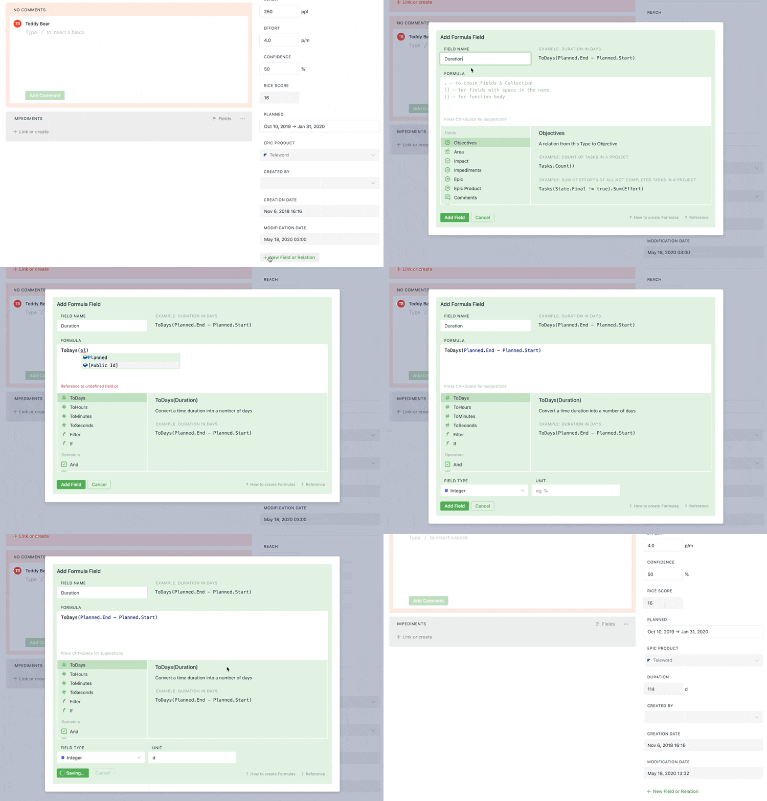
In Fibery formulas are easier to create and you have full autocomplete. You don’t have to remember all the fields and type text in quotes. The same formula two times faster in Fibery to create:
Views
Views show information from databases. Views are windows into the data.
Entity View
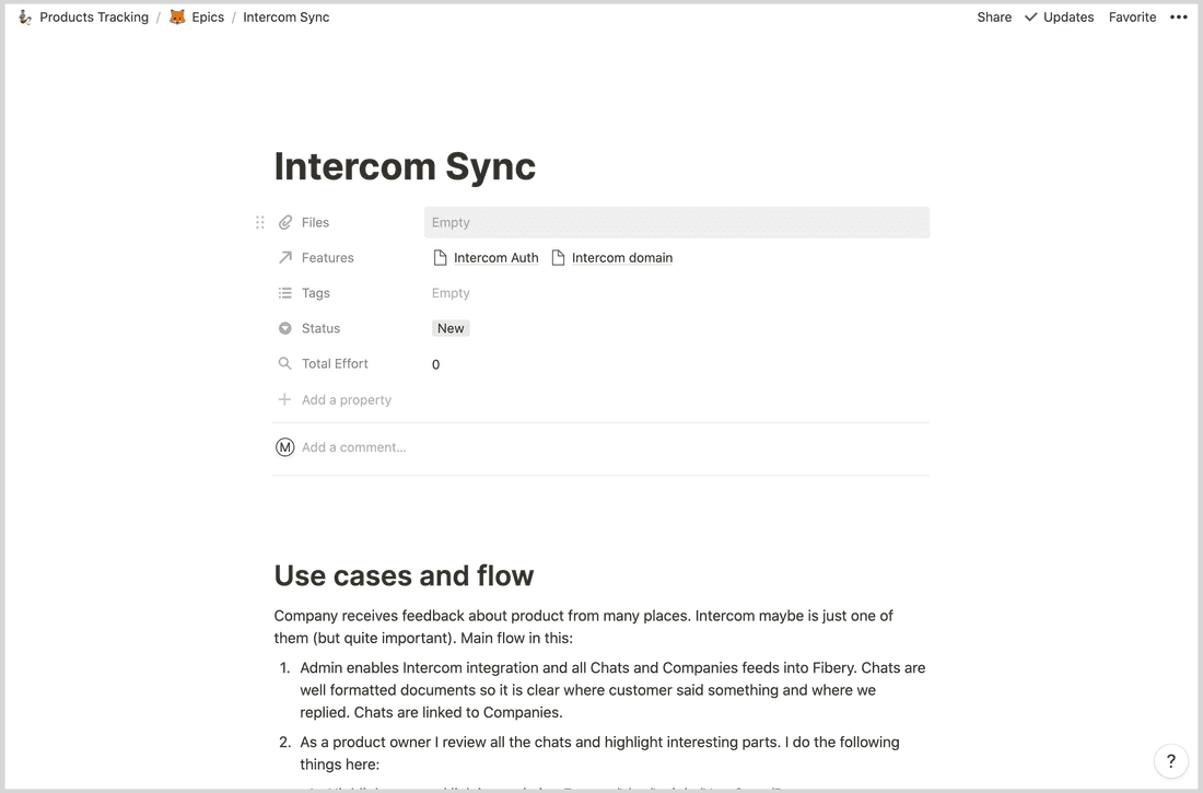
This is a View that shows a single entity/card and its details. In Notion you see all properties on top. This is not very convenient when you have an important information as a text (feature specification, for example).
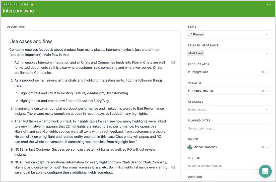
In Fibery Entity View layout is tailored for work items. You see texts and collections (list of Tasks, for example) in the left area, and all other properties in the right area:
Board View
Board Views are pretty similar in both tools.
Fibery advantages: Create vertical and horizontal lanes, color code cards to highlight important info.
Notion advantages: calculations in columns, like total effort, card preview with text or image.
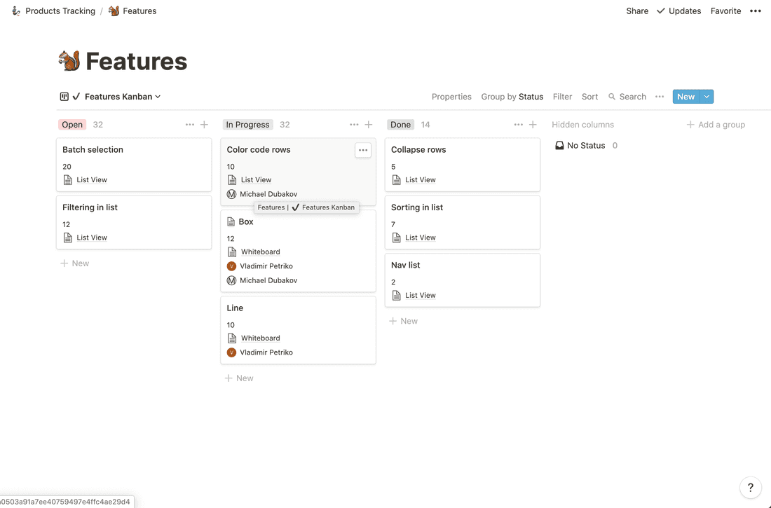
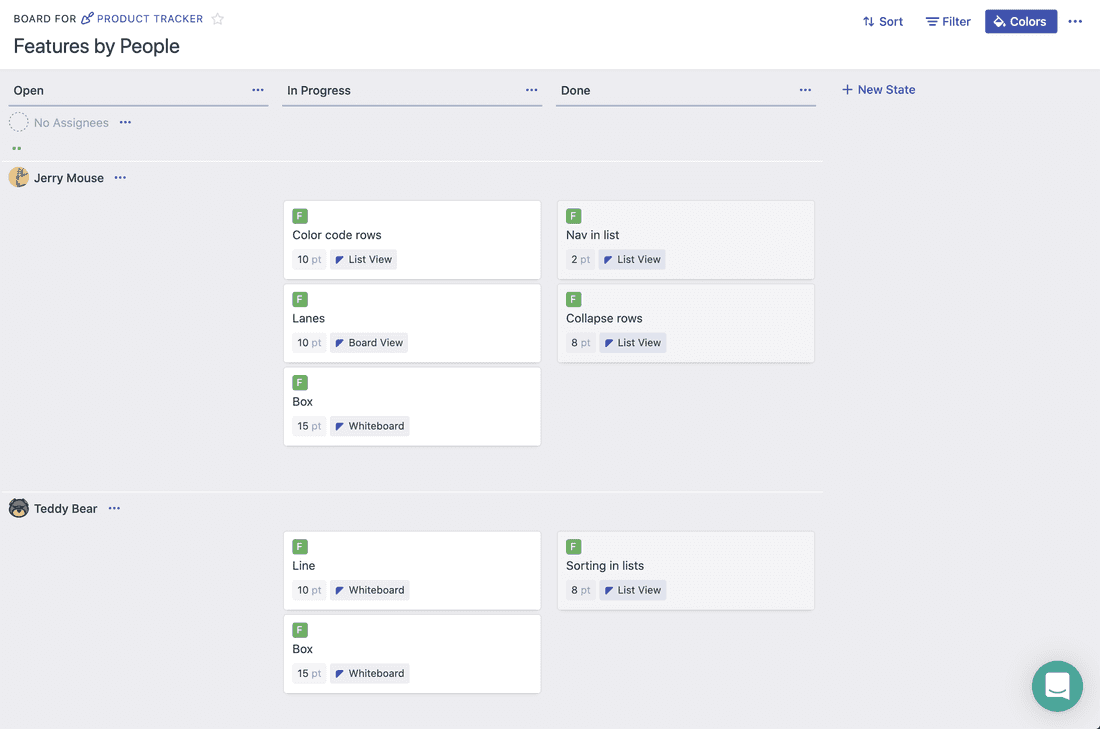
Table View
Table View is better in Notion. There are many usability things, like drag and drop rows. drag and drop columns, action in expected places, summary row. In Fibery tables are good enough for most cases, but still lack Notion polishing.
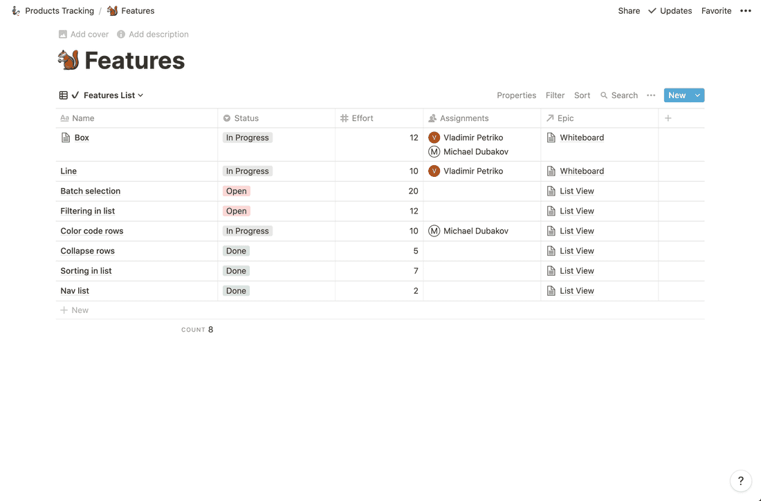
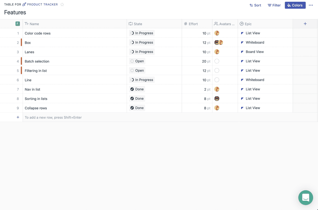
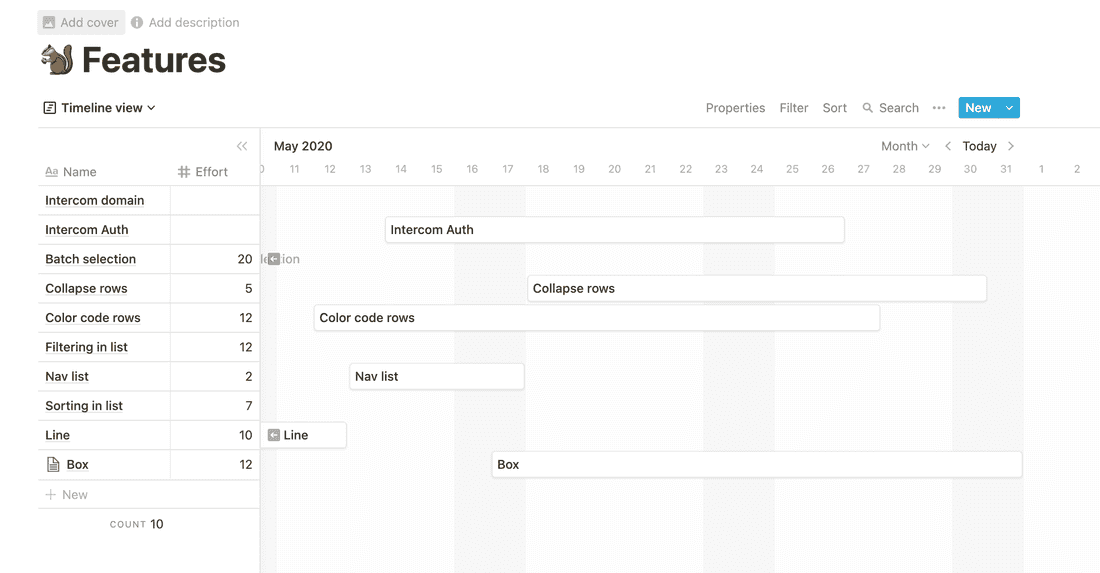
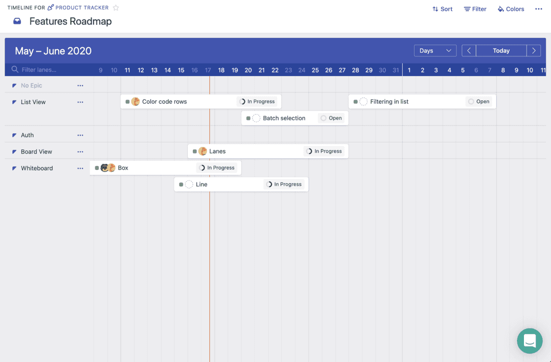
Timeline View
Timeline View is valuable when you want to plan releases, create product roadmaps, see workload by person per week, etc.
Calendar View
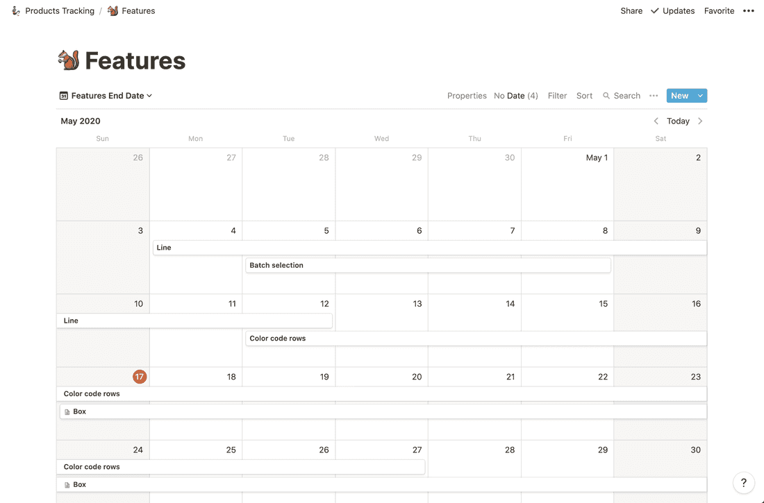
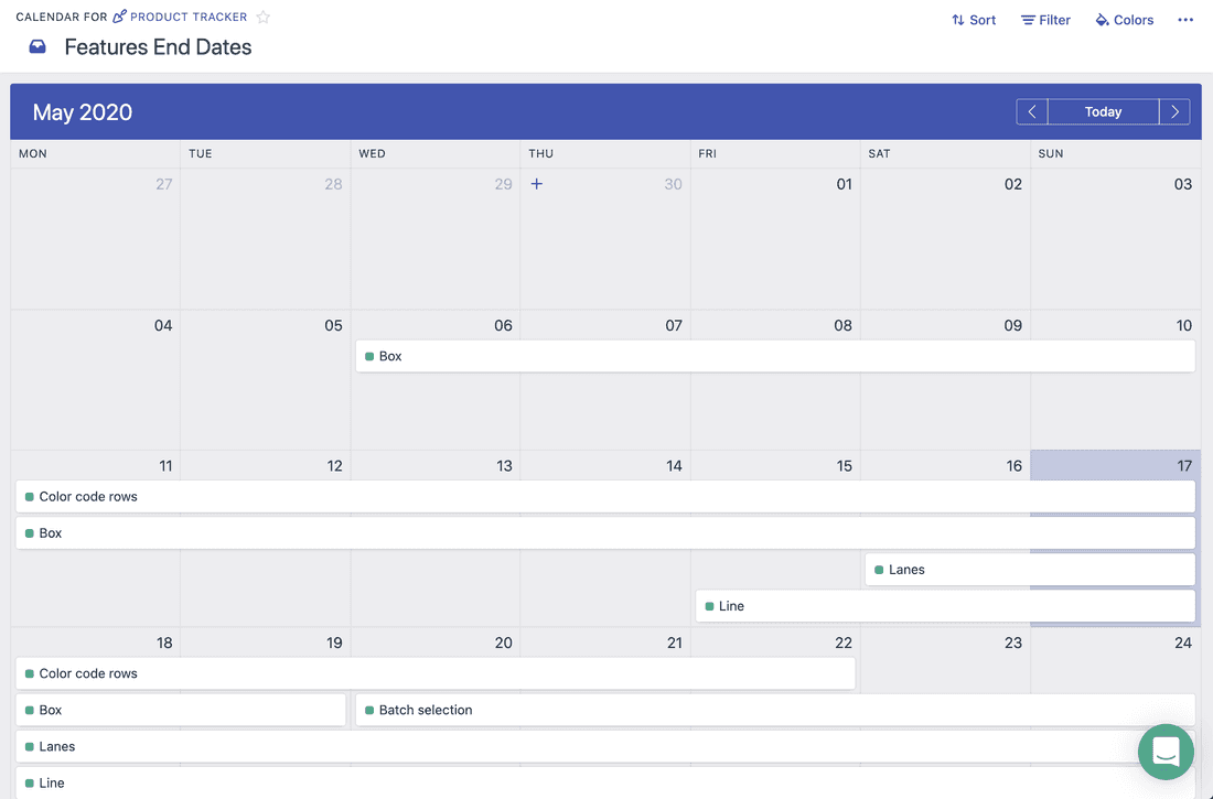
Calendar Views are almost identical. Slightly more advanced in Fibery, since you can color code cards and have week/day view in calendar. However, Notion’s Calendar View is better polished.
Notion unique Views
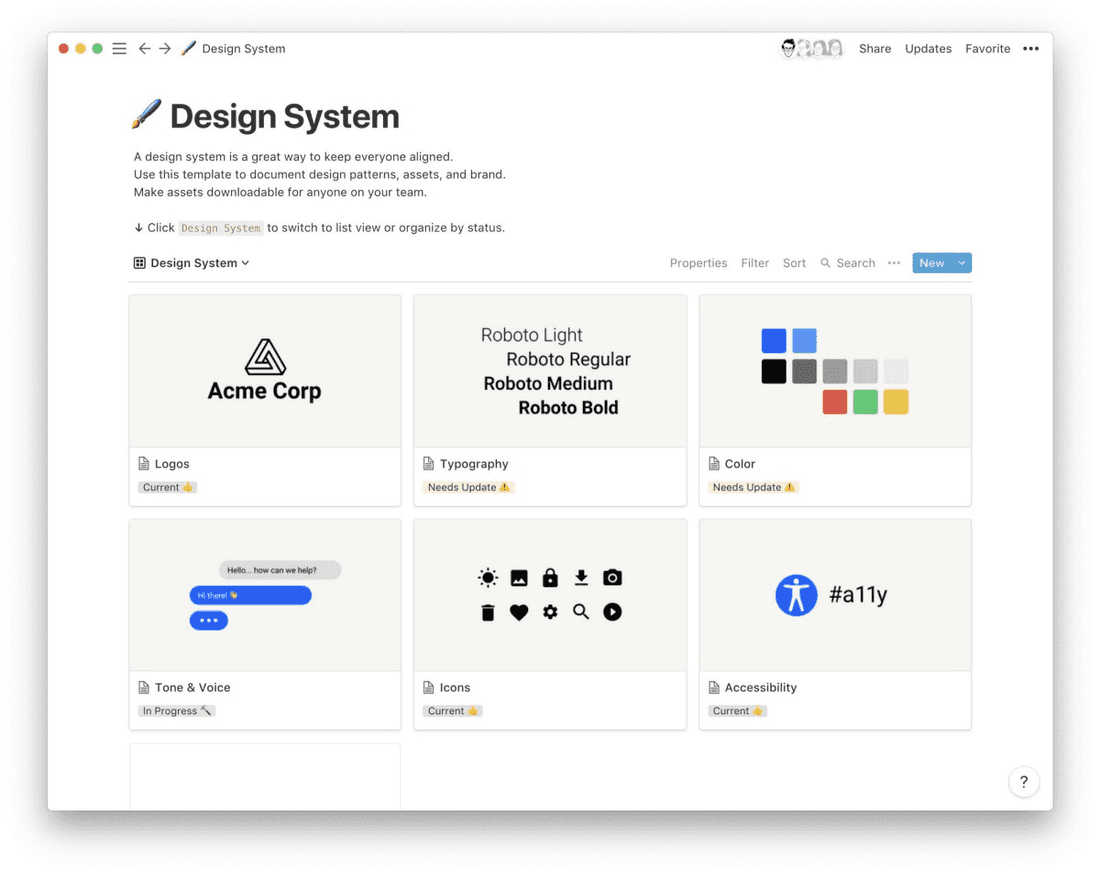
Notion has just one unique view that does not exist in Fibery yet — Gallery View.
💪 Gallery View
Gallery View is great for design mockups, mood boards, people with faces, etc.
Fibery unique Views
Fibery has three unique views: Whiteboard, Chart and Form.
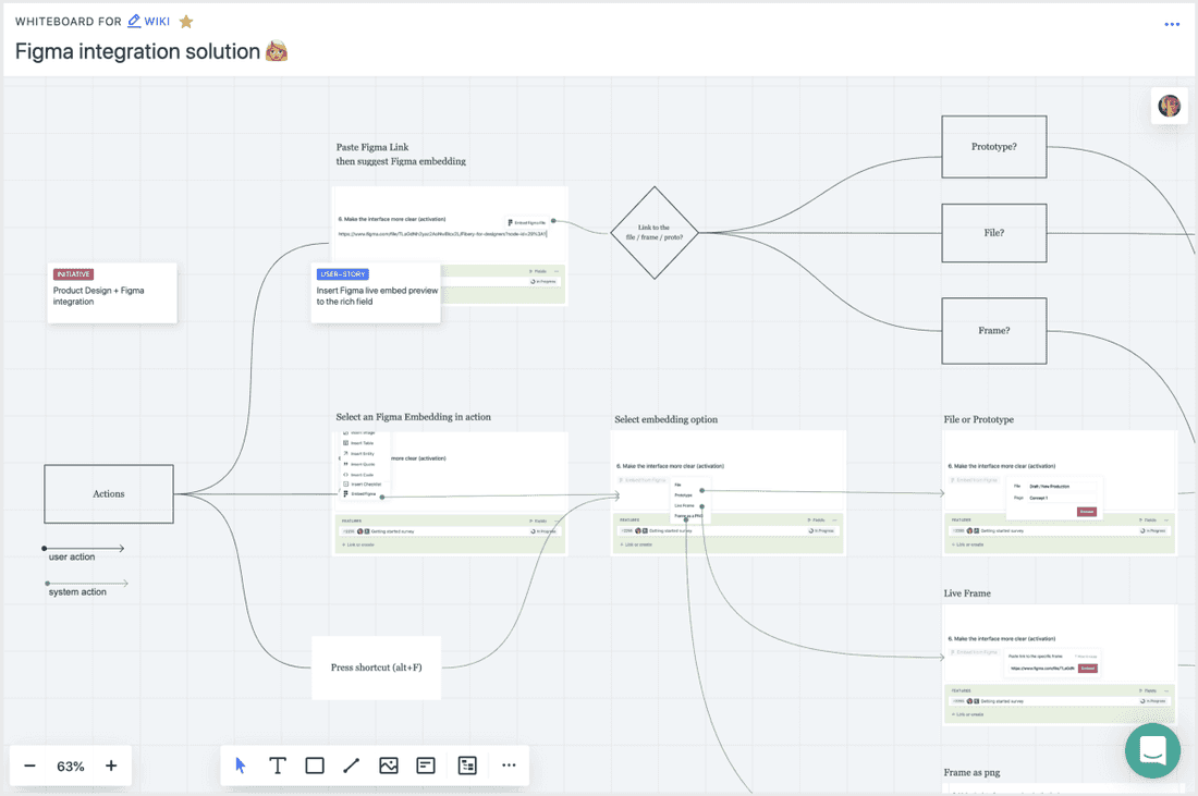
💪 Whiteboard View
Whiteboard View can be used as a canvas to create diagrams, mind maps, customers journeys, mood boards, schemes.
💪 Chart View
Charts are really powerful in Fibery. You can visualize any data, calculate metrics on the fly and share charts outside Fibery.
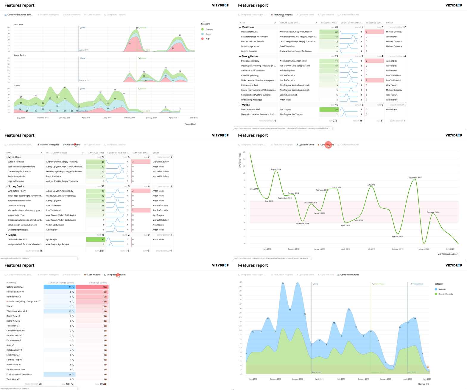
As you see, Fibery already is more advanced in Views. However, Views in Notion are better polished and more pleasant to use in some cases.
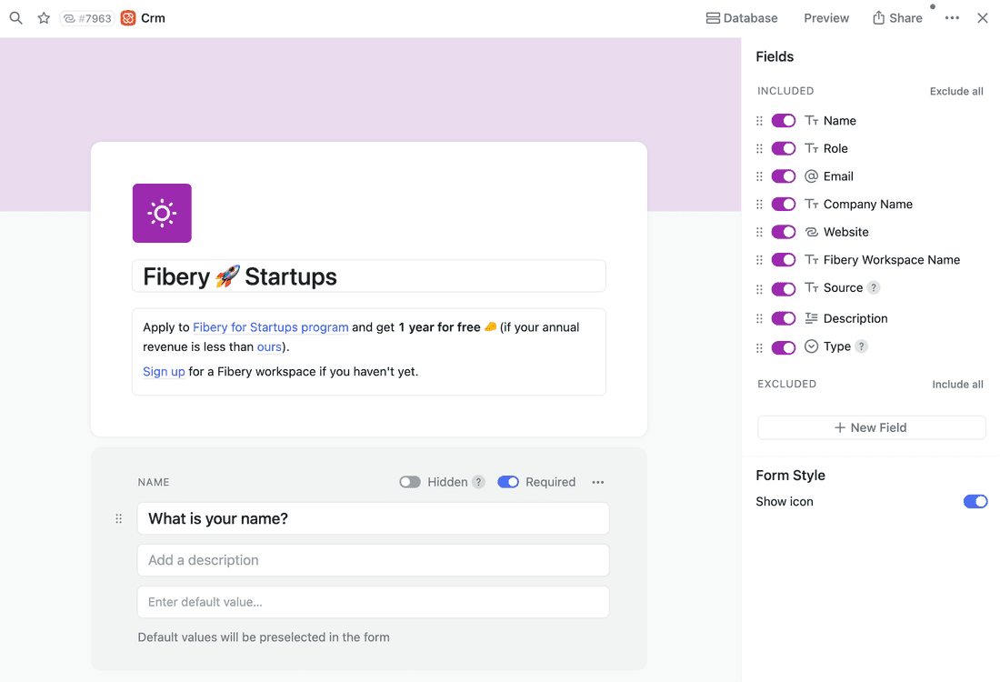
💪 Form View
Forms are great way to capture data from the outside world: candidate applications, issue requests, etc.
API & Integrations
Not has a very good API released in May 2021 (beta). You can work with databases and pages content.
Fibery has a more complex API.
In fact this is quite low level API, but it’s very powerful. You can create databases and build your own schema using API, and definitely you can do pretty advanced queries and create entities. Webhooks are there as well.
Fibery has a GraphQL as well, so you can enjoy great tooling and create integrations fast.
Fibery has native integrations with dozen of popular tools. It sync data from these tools, so you can build a connected hub in Fibery that unites all the important data from HubSpot, GitLab, Intercom and other sources.
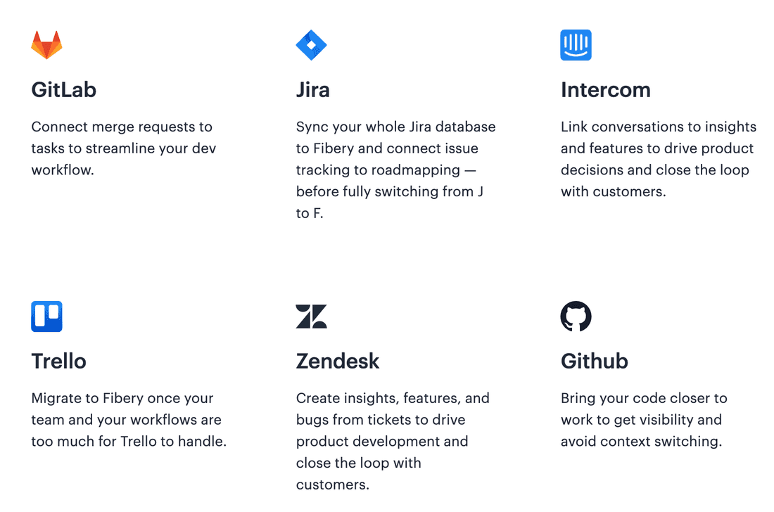
Notion has no native integrations, but you can build them via API.
Performance
💪 Notion UI is slightly faster.
In many cases you has almost desktop-like experience and there are zero delays between your actions. Notion is a joy to use.
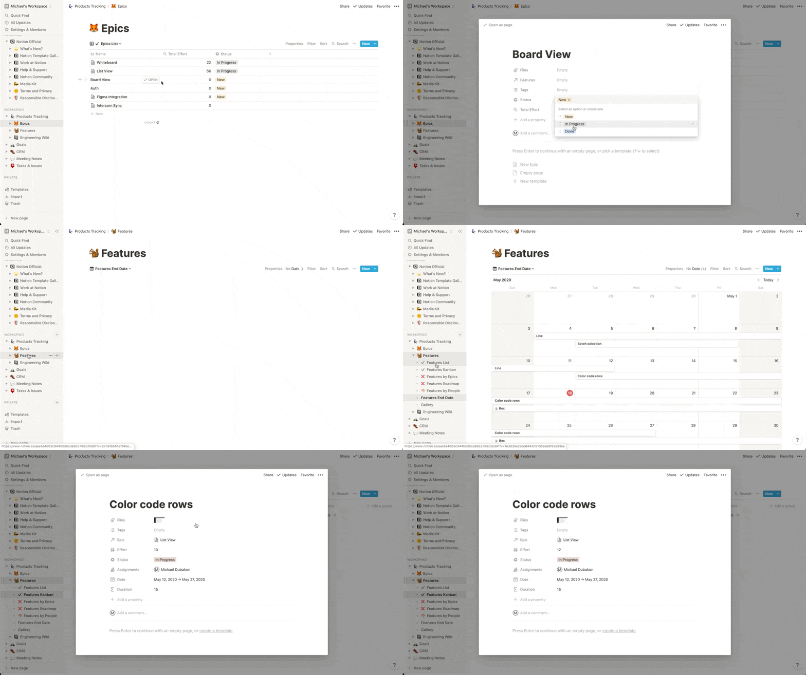
Fibery is slightly slower.
In some cases you have to wait 2+ seconds to load a view. We are trying to make Fibery right first, and then fast. “Get it right” stage is not over for Fibery, so our goal is to have a “good enough” performance so far.
Public sharing and permissions
💪 Notion has a good public sharing. You can share workspace to outer world, make a web page with vacancies, share product roadmap or even create a web site with Notion.
🦐 Fibery has more limited public sharing. You can share a single document or an entity, but it is not possible to share views.
Mobile
💪 Notion has great mobile apps. They work perfectly well. Mobile support is a must have for personal use cases.
🦐 Fibery has no mobile apps so far. You can access web version, but the user experience is just bad. With a team/company focus mobile apps are less important, since mostly people use laptops. Anyway, we’ll definitely add them in future.
Automations
🦐 Notion has no automations so far.
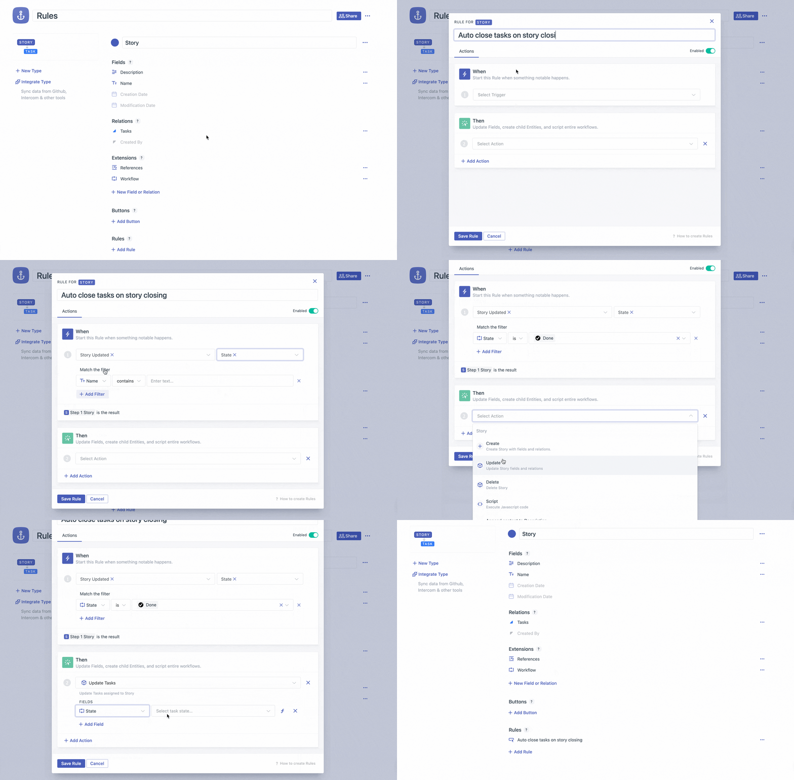
💪 Fibery has built-in automation rules engine. You can build powerful flows reacting on all events in Fibery and executing various actions. You can even use formulas in Actions!
Summary
Short summary is this:
💪 and 🦐
Fibery
---
🦐 Harder to start
💪 You can connect Spaces (Workspaces)
🦐 Documents are less cool
💪 Entity View layout is much better
💪 Better bi-directional references
💪 Board View is more advanced
💪 Charts are really powerful
💪 Form View
💪 Whiteboard View to create diagrams and mind-maps
💪 Powerful integrations that sync data from external systems
💪 Automation Rules and Action Buttons
🦐 No mobile apps


Notion
---
💪 Easy to start
🦐 Hard to connect Databases
💪 Pages are cool
💪 Easily change field type on the fly
🦐 Entity View layout is not very good
🦐 No Charts
💪 Gallery View
💪 Good public sharing. You can share almost anything.
💪 Great mobile apps
🦐 No Automations
Notion
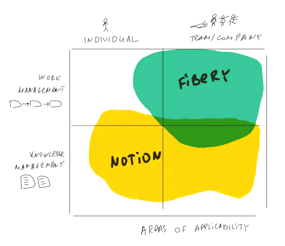
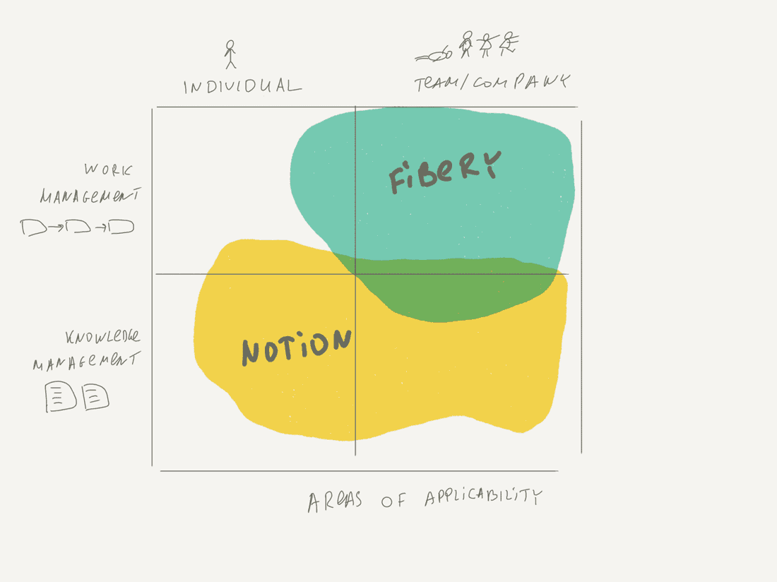
🕶 Notion is pages and documents first, databases and views second. Notion works best for individuals and small teams (as a knowledge base notion works for the whole company just perfectly).
The power of Notion: Fantastic UX, documents, and sharing
Cases where Notion shines:
- Individual notes tacker or life organizer
- Company wiki, knowledge base, public pages
- Work management for small teams
Fibery
🍀 Fibery is connected databases and views first, documents second. Fibery works best for teams and small/medium companies.
The power of Fibery: Databases, relations, unique Views (Whiteboard, Chart), and automations.
Cases where Fibery shines:
- Work management processes (product management, software development, CRM, etc.)
- Teams of all sizes
- Whole companies up to 200 people
Let’s play a game! Register your Fibery account and find 10 differences between Fibery and Notion. 👾
Psst... Wanna try Fibery? 👀
Infinitely flexible product discovery & development platform.
