Hypertext Tools From the 80s
I love history. To me, it’s a great source of systems evolutions and dynamics examples. When we see the world as is, we just see its current state. It’s fine, but without history, you have a hard time understanding the deep processes that get us here. And in some cases, history is full of gems.
In this article, I briefly review some hypertext systems from the 80s. The pre-internet era was full of wonderful and very powerful systems that are well forgotten now, but we definitely can learn from them, try to understand why we had an enormous degradation in the 1990s and 2000s, and why we are enjoying hypertext systems renaissance now. It’s interesting to see how hypertext systems in the 80s were superior in terms of some functionality to the most modern web apps.
Let’s use a Human/Organization/World scale to evaluate the tools. Every human possesses some volume of knowledge that usually expands through the lifetime. The same concept is true for organizations and the whole world. Hypertext systems quite naturally fit this scale.
Human-level
There were several notable systems in this segment: Guide (1982), NoteCards (1984), HyperCard (1987). HyperCard was the most famous, but I want to focus on NoteCards instead.
NoteCards (1984)
NoteCards was developed at Xerox PARC and it was designed to help people work with ideas.
It was a very rich system that had several building blocks: Notecard, Link, Browser card, Filebox.
- Notecard: A notecard is an electronic generalization of the 3x5 paper notecard. Each notecard contains an arbitrary amount of some editable substance such as a piece of text, a structured drawing, or a bitmap image.
- Link: Links are used to interconnect individual notecards into networks or structures of related cards. Each link is a typed, directional connection between a source card and a destination card. The type of a link is a user-chosen label specifying the nature of the relationship being represented.
- Browser card: A browser is a notecard that contains a structural diagram of a network of notecards.
- Filebox. Fileboxes are specialized cards that can be used to organize or categorize large collections of notecards. They were designed to help users manage large net.
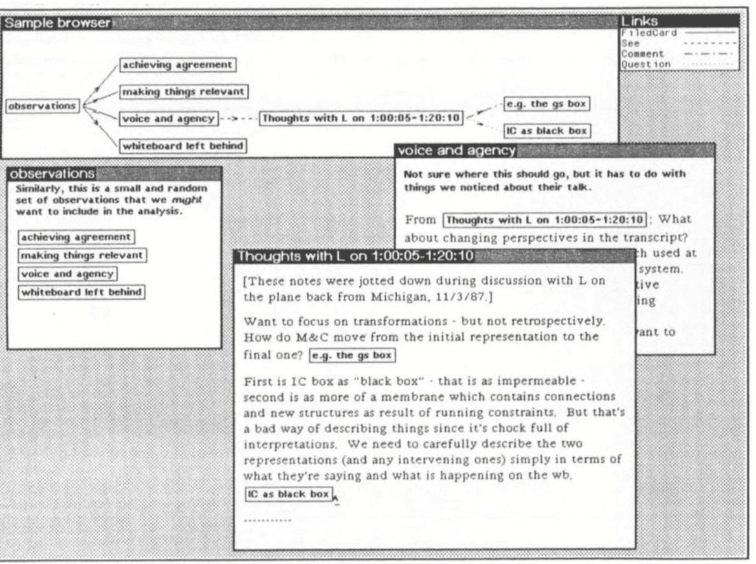
Overall, you create content using Cards, organize Cards using Links and Fileboxes, and navigate using Browser and Links. As you see, there are only two main structures: Cards and Links. Cards didn’t have Blocks (like Roam), so every card had to be quite small to keep connections sane.
People used NoteCards for all kinds of things: project management, engineering design, educational systems, etc. In later versions, they added collaboration possibilities, so it was used in small workgroups as well.
NoteCards pioneered concepts such as typed links and graphical overview maps of hypertext documents.
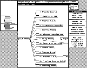
Even by today’s standards, this system is quite feature-rich.
Organization level
Augment/NLS (1960s) was the first connected knowledge management system that was designed to work on an organization level. The team used NLS for everything: documents, specs, bug tracking, etc.
During the Augment project, the researchers stored all their papers, reports, and memos in a shared “journal” facility that enabled them to include cross-references to other work in their own writings. This journal grew to over 100,000 items — Jakob Nilsen, The History of Hypertext
Overall, collaboration software creation was relatively hard in the pre-internet days. You had to install the client on every machine to enable collaboration and connection speed was slow, so you had to design such systems very carefully to make them usable. Maybe that is why we saw many examples of human-level tools, but fewer examples of organization level tools.
Intermedia (1985)
Intermedia was created at Brown University and was used primarily for education courses creation. The main paradigms were:
- Linking as easy as Copy/Paste
- Embedded in all apps
- No difference between reading & authoring
- Multi-user and networked

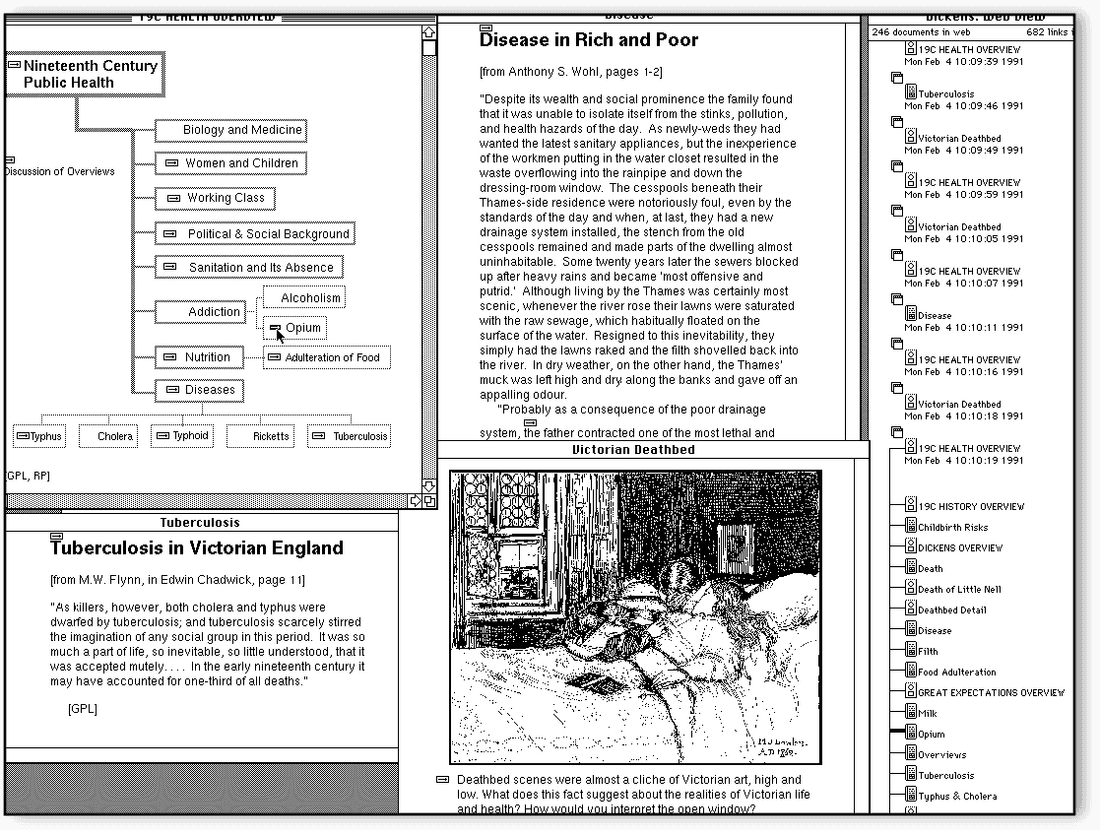
You would be surprised if we’ll dig into the Intermedia feature set. Let’s just enumerate them:
- Webs (different sets of links over the same set of documents)
- Bi-directional links, anchors, one-to-many links
- Copy/Paste metaphor for link creation (Start Link/Complete Link)
- Full-text searching
- Local map (view of links in and out of a document plus history of followed links)
- Warm Linking (pulls and push data across the link)
- Annotations (Multiple users commenting on documents using warm links)
- Variety of apps (Timeline, drawing, text, animation, etc.)
- Templates (Pre-defined sets of pre-linked documents).
I want to emphasize two cool ideas:
It was possible to create diagrams and link objects to specific parts of any document. So diagrams and documents were first-class citizens.
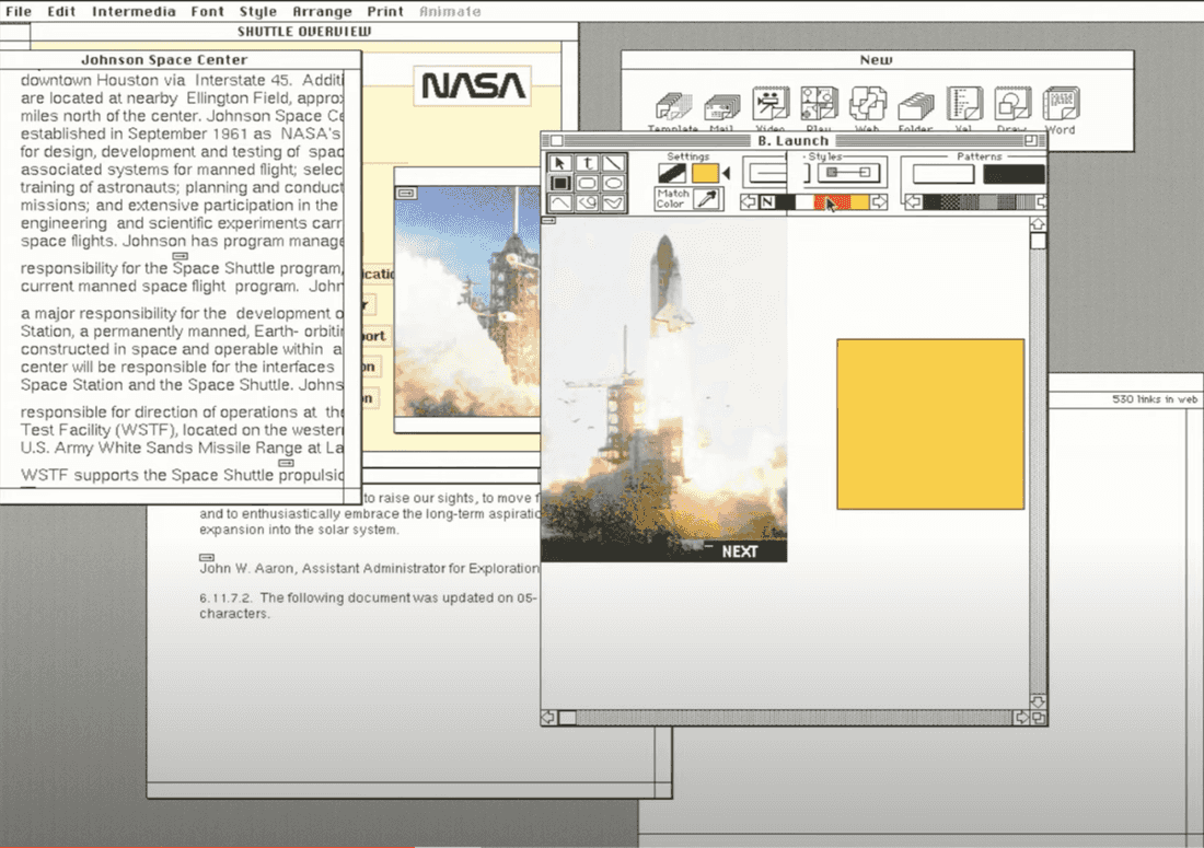
It was also possible to create many Webs on top of documents. Every student was able to create her own web. It is a forgotten concept, but it might be useful in a collaborative environment where we can share our knowledge.
I recommend this detailed Intermedia demo for curious minds.
Today we have no comparable system. Some are moving in this direction (Notion, Coda), but they are not there yet. Information handling inside companies is just like the Internet in 1997. You have many disconnected tools and have to browse or search inside these tools to find what you need.
The real problem is that knowledge management and work management are separate things in an organization, and there are different tools for these things. Indeed the current status quo is a set of specialized tools to handle structured information (Asana, Jira, Salesforce, Intercom) and few tools to handle unstructured information (Google Docs, Confluence, Miro, Slack).
Fibery Mixes Knowledge and Work Management
Btw it adapts to your team and grows with it.
This is just wrong since the knowledge and work management dichotomy does not exist in reality. It’s an artificial construct.
The World
It’s somewhat strange that we have some good enough knowledge organization solutions for the whole world (WWW), but don’t have good solutions on more basic levels.
Indeed it is relatively easy to create a tool that simplifies knowledge management for a human. It is harder to create a similar solution for the organization. But it looks almost impossible to do that for the whole world. Yet that’s what happened…
AFAIK, there were only two global attempts to create hypertext systems: Xanadu and WWW.
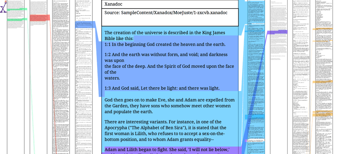
Xanadu was the first system that tried to capture the whole world. The paradigm was great and many parts of Ted Nelson’s vision are still relevant today: user identification, content authoring, documents compositions, permissions, micro-payments, content versioning, always live links.
Ted Nelson spent all his life pursuing this idea, but he was unable to release something viable before WWW and then it becomes too late.
Why did Xanadu fail?
Ted’s ambitions were too great. His vision was top-notch, but I think it should be shrunk to a human/organization level to succeed. In this smaller-scale niche, he had much better chances. Also, we think he overestimated the importance of transclusions, parallel documents, and versioning. These things are hard to implement and it just dragged the whole idea in the wrong direction. The main things in hypertext systems are nodes and links.
Why did WWW succeed? (1991)
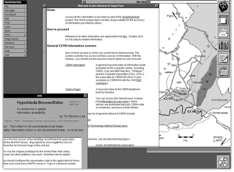
WWW changed the world because it was simple. There were already connected networks all over the world, and Tim-Berns Lee married hypertext and internet with URI, HTTP, and HTML technologies. Servers were easy to implement, the problem of document publishing and sharing was there for research institutions, so in a couple of years, it all went wild.
What are we missing now? There are many small things, but here are the top three in my opinion:
- We lost equality of authoring and reading. Content creation usually demands a separate website.
- It’s hard to collaborate on arbitrary content. Annotations, comments, personal links layers — we try to solve it via browser extensions and special apps like Evernote, but so far there is no good solution.
- There are no bi-directional links and transclusions are very limited. Documents can disappear and links become broken.
Review & Conclusions
I strongly recommend to check Augmenting Organizational Intelligence article to dig into this section.
Let’s quickly explore these systems from an augmenting intelligence point of view.
A tool that can augment human intelligence should accumulate structured and unstructured information in a single place and have instruments to collaboratively create, mix, connect, visualize and retrieve information.
How all the systems from the 80s fit into this concept?
- They supported authoring tools (like text and diagram creation) but did not support integration with other tools. Indeed it was not so important, since without Internet information lived in silos and was hard to extract and integrate.
- They mainly worked with unstructured context and didn’t try to put ontology on top of unstructured data.
- They connected information extremely well (even by today’s standards). Bi-directional links were common.
- They visualized information in very limited ways, usually just via network diagrams.
- They did not support a decent information mix overall. For example, there were no blocks inside Documents, no transclusions, and very limited visualizations.
Here is the image that summarizes pre-internet hypertext systems support of intelligence augmentation.
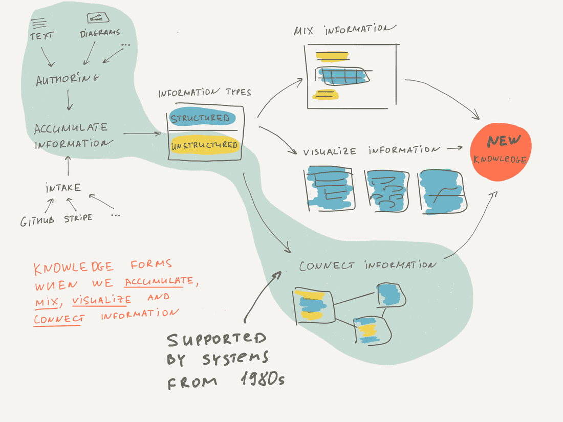
As you see, these tools mainly focused on authoring and connecting unstructured information. Interestingly, this is the focus of Roam as well, but it is more advanced in terms of mixing and structuring information.
Here we conclude the historical review with some observations:
- In the pre-internet era, hypertext systems were quite advanced and progress was great. They worked well for individuals and small workgroups.
- WWW was a seriously simplified version of a hypertext system, but it conquered the world. Then it became a standard model and a synonym of a hypertext. All new hypertext systems were implemented for the Web and were limited by the WWW model (Wiki, Blogs, etc). The irony of progress!
- Initially, it was not possible to create complex internet-based systems, since the technology was not mature enough. It took us 20 years to regain the possibility (I’d say around 2010). Thus we had a big black void of progress between 1990 and 2010. As a side-effect of this 20-years pause, old and advanced hypermedia systems were forgotten.
- Now we’re seeing a renaissance of hypertext systems: Notion, Roam, and Fibery are moving in this direction, re-discovering lost knowledge from the 1980s.
Here are good places to learn more about hypertext evolution.
References
- Vision & Reality of Hypertext and Graphical User Interfaces
- The History of HyperText (1995) by Jakob Nilsen
- Hypertext Conferences trip reports by 1987, 1989 by Jacob Nilsen
- Reflections on NoteCards: Seven Issues for the Next Generation of Hypermedia Systems (1988) [pdf] by Frank G. Halasz
- Hypertext, Theory Into Practice (1998) by Ray McAleese
- The Curse of Xanadu (1995) by Gary Wolf
- Information Management: A Proposal (1989) by Tim Berners-Lee
- Reflections on a Half Century of Hypertext (2019) by Andy van Dam
- Augmenting Human Intellect: A Conceptual Framework (1962) by Douglas C. Engelbart
- A Live Demo of the Intermedia Hypertext System (2020) by Norman K. Meyrowitz
- Literary Machines (1981) by Theodor Helm Nelson
- KMS: A Distributed Hypermedia System for Managing Knowledge In Organizations (1987) [pdf] by Robert Akscyn
Psst... Wanna try Fibery? 👀
Infinitely flexible product discovery & development platform.

