Metrics Fibery Team Use to Watch Customers | Part 1
In this article, we’re digging into the metrics that reveal how workspaces really function — from who’s actively using the product to how deeply teams structure and populate their data. We’ll explore both usage patterns and structural signals, highlighting not just activity, but adoption, collaboration, and the challenges of interpreting it all.

We will focus on two primary areas - Product usage and Data metrics. If you are interested to see what else is tracked and why - just let us know, and we will write part 2 🥳
Product usage
These metrics track how users engage with the product on a day-to-day basis — from logging in and clicking around, to completing key actions and exploring features. Product usage is the heartbeat of your workspace: if people aren’t actively using it, nothing else matters.
Why it matters Understanding product usage helps teams spot engagement trends, detect friction points, and prioritize features that truly drive value. It also highlights at-risk users and informs customer success strategies, onboarding improvements, and growth opportunities.
Examples of product usage metrics include:
- Weekly Active Users (WAU) - how many users were active in the past week.
- Total Users - the size of the user base, active or not.
- % of Active User - the portion of users who regularly engage with the product.
- Days Active (last 7 days): How consistently users are engaging, helping identify sporadic or steady usage patterns.
High-level takeaway: these metrics give a clear picture of adoption and engagement, showing not just who has access, but who is actually finding value in the product.
And these metrics help to build us dynamic reports like this one
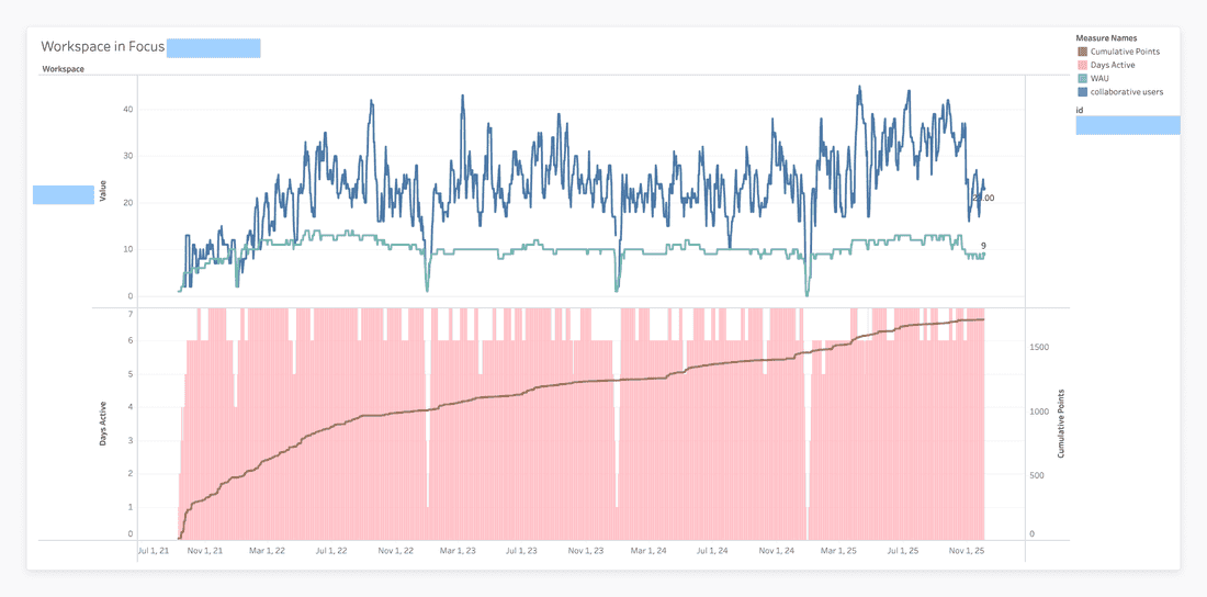
This chart is an example of how product usage can be tracked both in the short term and over the long haul. The top panel captures the daily pulse of the workspace with metrics like Daily Active Users (DAU) and Weekly Active Users (WAU), showing immediate engagement patterns and the reliable dips during weekends.
The bottom panel zooms out to reveal long-term trends, using Days Active bars to highlight consistent engagement and a cumulative line (like total points or completed tasks) to illustrate ongoing value creation. By combining high-frequency daily metrics with lower-frequency cumulative data, this visualization tells a two-part story: the day-to-day rhythm of user activity alongside the steady, upward trajectory of long-term impact. It’s a clear, intuitive way to see both the intensity and the durability of product adoption.
So, let’s dive deeper into metrics used.

Weekly Active Users (WAU)
The first (and often loudest) signal for Customer Success is simple: are people showing up? To measure that, we rely on our trusty Weekly Active Users (WAU) metric — the heartbeat of product engagement.
Where it lives - CRM, in Workspace database - our Company analogue (in a nutshell). And here is the formula we
useUsers.Filter((IsEmpty([Last Seen At]) = false) and (ToDays(Today() - [Last Seen At]) < = 8)).Count()
What it actually means
WAU is simply the number of users who have been active in the last 7 days.
Well… technically 8 days — because timestamps are messy, time zones exist, and life is too short to debug edge cases every Monday morning. This slightly padded window makes sure we count people who really are active, even if their last activity happened 7 days and 12 minutes ago.
WAU gives us a quick pulse check on the product:
- It shows whether the user base is growing, shrinking, or just having a quiet week.
- Drops in WAU often signal onboarding issues, confusing UX, or “I’ll deal with this tool later” syndrome.
- And we have some alerts on that 😅 - Consistent growth = users finding value.
Sudden dips = maybe go check Slack… something’s burning.
Limitations (because no metric is perfect)
WAU doesn’t tell us how users behave or why they disappear. It only tells us that they appeared recently. It’s directional, not diagnostic.
Total Users
Before we dive into activity and engagement, there’s a simpler question: how many people are actually in this workspace?That’s where Total Users comes in — the most straightforward metric in the entire Stats space.
Formula:Users.Count()
Data Sources: All user records in the Stats space - btw, they are all anonymous cos we respect the privacy 😅
What it actually means
This metric counts every single user who exists in the workspace. Active, inactive, dormant, forgotten, ghosts-from-2019 — everyone gets included. It’s your full headcount.
Understanding total workspace size helps to:
- See how big the team could be if adoption improves
- Compare team size against the number of paid seats
- Spot organic growth or shrinkage over time
- Predict potential revenue expansion (or churn risk)
Limitations
This metric doesn’t care whether people are using the product, have ever logged in, or even remember having an account. It’s quantity, not quality. Great for capacity planning — less great for bragging about engagement.
Percentage that are Active Users (a.k.a. “How many people are actually awake?”)
Now that we know how many users exist and how many were active this week, we can combine the two and ask the real question:“What percentage of this workspace is actually alive?”
Formula:[Weekly Active Users] / [Total Users]
Data Sources: WAU + Total Users
What it actually means
This metric shows the share of users who are actively using the product — not just accounts sitting in a drawer collecting dust.
This is one of the best early indicators of:
- Adoption quality: Are people embracing the tool or just ignoring it politely?
- Underutilized seats: “You have 100 licenses… and 7 humans actually logging in.”
- Expansion opportunities: If adoption is strong, paid seats often follow.
- Early warning signals: Low percentages often mean: confusion, misalignment, or “we onboarded only the champion and forgot everyone else.”
Limitations
This metric can get fuzzy if a workspace has:
- Hundreds of free guests/observers (common case, btw)
- Entire teams invited “just in case”
- Legacy accounts that could star in a digital archaeology museum
In these cases, the % of Active Users looks worse than reality — not because people aren’t using the product, but because the denominator is inflated.
Real Example
On of our real customers
- 108 WAU
- 10k+ total users
- → 1% active rate
This is… impressively low. But! We know that they are in the adoption, many of those users are deactivated (but less than could be), and they will start adoption team by team, so these number make a lot of sense. Context, not just numbers - that’s what is important.
Days Active (from the last 7)
(a.k.a. “How many days this week did someone actually show up?”)
If Weekly Active Users tells us who showed up, this metric tells us how often. It’s a small but surprisingly revealing signal about workspace health:
Are users popping in once a week… or living inside the tool?
What it actually means
This metric counts how many days in the past week anyone in the workspace touched the product.
The scale goes roughly like this:
- 0–1 days: The workspace is either dead or on vacation
- 2–4 days: Casual usage — they treat your tool like a gym membership
- 5–7 days: Consistent engagement, usually a good sign of habit formation
This is a great at-a-glance indicator for:
- Consistency: Are users actually adopting the tool as part of their workflow?
- Red flags: “Only active on Mondays” often means usage is meeting-based, not habitual
- Progress: You can literally count onboarding wins as they move from 1 → 3 → 5 active days
- btw, this kind of report we have in Tableau, and it really helps!
Limitations
It only looks at a 7-day window, which means:
- Holiday weeks lie
- End-of-quarter crunch overinflates activity
- It can’t tell who was active — just that someone was
Still, a surprisingly useful “heartbeat check.”
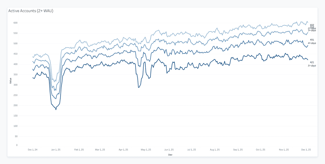
Only accounts with at least two weekly active users are included. By excluding single-player or dormant accounts, the visualization focuses specifically on collaborative teams.
Filtering for collaboration also tightens the curves. There are fewer “casual” teams; most are either fully engaged or churn. This highlights a binary dynamic common in B2B SaaS: once teams start working together, they either commit fully or drop off.
The overall trend is upward, rising from ~450 to ~600 over the year. This demonstrates that the product isn’t just attracting random signups - it’s building and retaining collaborative teams that generate sustained usage. The January dip is visible here too, reflecting seasonal behavior rather than engagement issues 😉
❔How do you think, what is more complicated - building new chart, or reading it properly?
Activated
(a.k.a. “Have they crossed the magical line where they finally ‘get it’?”)
Activation is that wonderful milestone where a workspace transitions from “sign-up curiosity” to “actual value.” This metric captures exactly one thing: did they reach that state or not?
And in Fibery it was the most challenging metric to formulate. How should it be calculated? What do we have available to utilise? … Still not perfect (and never will be) and has to be re-thought regularly, as the product evolves and our vision changes. Great exercise for any team, btw. What do we expect our users to do?
What it actually means
A simple yes/no flag indicating whether the workspace hit the internal activation criteria — whatever your product team defines that as.
It’s like the workspace equivalent of a coming-of-age ceremony:
They either made it… or they did not.
Activation is one of the strongest predictors of:
- Long-term retention
- Future usage intensity
- Likelihood to pay (and keep paying)
- Where to focus onboarding attention
If a workspace hasn’t activated yet, we know exactly where to spend your next hour.
Limitations
It’s binary.
Which means:
- No nuance
- No sense of how close they are
- No visibility into partial activation
It’s a great checkpoint — but not a diagnostic tool.
Few more examples
These reports were built by using the same data. Trends, that what matters, rather than a record-stamp.
And we can still have workspace-level dynamic.
North Star
(a.k.a. “Are people actually collaborating, or just quietly clicking alone?”)
When talking about real product adoption, there are “users,” and then there are people working together — and those two are not at all the same thing. This is where the North Star metric comes in. If WAU shows activity, North Star shows collaborative value creation.
Spaces.Filter([Active Users] >= 2).Sum([Active Users])
What it actually means
In simple terms:
We count all active users, but only in spaces where at least two people are active.
Why?
Because a space with a single active user is not collaboration — that’s a personal notebook.
A space with 2+ active users is where real teamwork (and long-term value) happens.
So the North Star captures:
- Where the teamwork is happening
- How many users are involved
- How “alive” the workspace is as a collaborative environment
It’s a much better indicator of retained value than raw activity.
Because North Star directly correlates with:
- Likelihood to retain (“teams that work together, stay together”)
- Adoption depth (more collaborative spaces = more embedded workflows)
- Expansion potential (teams that win → add more teams)
- Health scoring (a workspace with North Star = 3 is not the same as one with 300)
it’s one of the strongest signals that a workspace has become sticky.
Limitations
- Ignores single-user spaces entirely (which is usually fine — but occasionally you’ll upset a lone power user) Doesn’t show which teams are collaborating — just the totals
- If a workspace has many private or siloed spaces, it may underrepresent real usage
- Some teams cram everything into a single parent Space with dozens of databases tucked inside. And while the system technically allows it, this “everything in one giant box” approach makes it genuinely difficult to extract meaningful insights. It’s a natural downside of a structure that’s too flexible: you get freedom, but you also get a data swamp. The point isn’t that the setup is wrong — just that it limits what analytics can realistically reveal.
Still, as far as high-level health metrics go, this one is gold.
Real Example
Some real customer here:
North Star: 276
WAU: 232
This workspace actually has more users collaborating in active spaces than the total weekly active users — which usually means multiple teams, multiple workflows, and strong product adoption across the org.
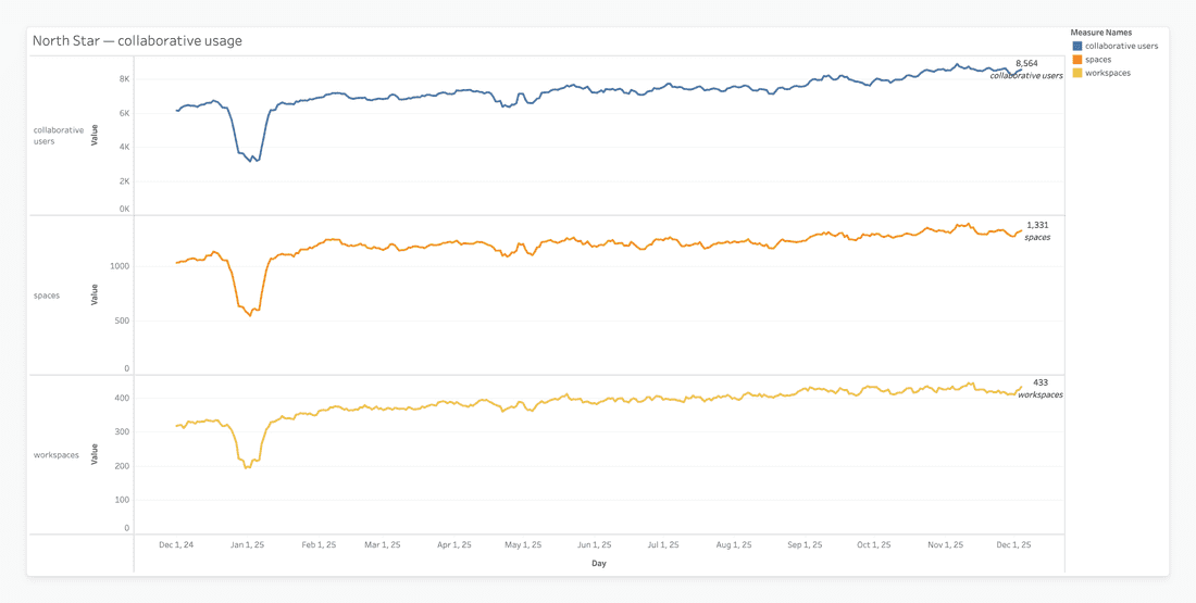
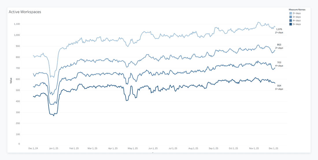
This chart tracks three related metrics - Workspaces, Spaces, and Collaborative Users - to check whether growth in accounts is actually meaningful. The bottom line shows Workspaces (account level), the middle line shows Spaces (structural level), and the top line shows Collaborative Users (human level). When the lines rise together, it confirms that new workspaces are creating spaces and inviting users. If the bottom line went up while the top line stayed flat, it would signal “hollow growth” (lots of signups but little adoption). The chart also lets you eyeball ratios - for example, ~8,500 users across ~430 workspaces averages roughly 20 users per workspace. If that ratio shrinks over time, it might indicate smaller teams or single-user setups.
Finally, the chart highlights macro trends like holidays, where dips in all three lines reflect real-world seasonality rather than product issues, showing that usage rebounds consistently.
Collaborative Spaces
(a.k.a. “Where teamwork actually happens — not just nicely labeled folders”)
If the North Star tells us how many people collaborate, the Collaborative Spaces metric tells us where the collaboration happens. It’s the “is anyone actually working together here?” test.
Spaces.Filter([Active Users] >= 2).Count()
What it actually means
This metric counts how many spaces have at least two active users.That’s it. Two humans doing something vaguely productive in the same space. Congratulations — we call that collaboration.
It helps separate:
- Spaces where people are actually using the product together
- From spaces that are basically someone’s digital junk drawer
More collaborative spaces = more embedded use cases. We use this metric to understand:
- Depth of adoption — is the product used as a team system or just an individual scratchpad?
- Silo risks — lots of single-user spaces often mean stalled adoption
- Where to help expand — teams using one shared space can often be nudged into creating more
Limitations
- Yes, the “2-user” threshold is arbitrary, but it works surprisingly well
- Doesn’t account for how active those users are
- Doesn’t distinguish between a thriving project and a space someone accidentally clicked into
% of Active Spaces
(a.k.a. “How alive is the workspace overall?”)
If Collaborative Spaces gives us the count, % Active Spaces gives us the ratio. It’s a workspace vitality score — the share of spaces with real collaboration.
(Spaces.Filter([Active Users] >= 2).Count() / Spaces.Count()) * 100
What it actually means
This tells you what percentage of all spaces are actively used by at least two people. If your workspace has 100 spaces but only 4 are active, well… that’s not a product problem. That’s a spring cleaning problem.
Why Customer Success cares
This metric helps CS understand:
- Overall workspace health — is the tool central to how the team works?
- Breadth of adoption — how many teams, projects, and contexts rely on it?
- Expansion opportunities — inactive spaces may represent teams that haven’t adopted yet
Limitations
- Inflated by empty or abandoned test spaces
- Punishes workspaces that create “one giant space for everything”
- Doesn’t show which spaces matter most — only how many are active
Data & Structure Metrics
(a.k.a. “How much stuff did you put into the workspace, and does any of it matter?”)
Not all metrics are about users clicking around. Some are about the ecosystem they’ve built — the databases, the entities, the structures that either create a powerful knowledge hub… or a digital attic full of half-finished ideas.
These metrics help CS understand how deeply a workspace has invested in Fibery as a system.
Total Entities
(a.k.a. “How much content lives here, and is anyone emotionally attached to it?”)
What it means
This is the grand total of all records ever created in the workspace. Tasks, documents, contacts, experiments, abandoned side quests — it’s all counted.
A workspace with a high entity count has usually:
- Invested time and thinking into the tool
- Offloaded actual business processes
- Created content they don’t want to lose (stickiness!)
It’s one of the biggest signals that a workspace is becoming a power user.
Limitations
- Includes test junk, demo data, and the CEO’s “ideas I’ll get to someday”
- Says nothing about data quality
- High volume ≠ high value
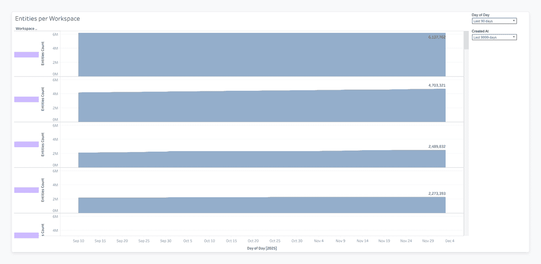
Unlike charts that track human activity, this one focuses on the workspace’s data footprint. It measures the total number of entities—tasks, documents, records, or other database items - within each workspace. This perspective highlights which workspaces carry the most technical and operational weight, revealing both engagement and structural investment.
- The standout feature is the sheer volume of entities. Some workspaces host millions of records, showing they’re not just used for occasional sprints - they function as central hubs or large knowledge repositories. High entity counts signal strong retention: moving millions of records to a competitor is a major barrier, making these workspaces “sticky” even if daily activity fluctuates.
- But is it? When you have 6 million records like above - wow, that’s impressive. Here we can start thinking, whether Fibery for them is a good choice - we never aimed that we designed Fibery as a data storage tool. And if Fibery is a thoughtful choice - then we have to ask ourselves, do we charge enough for such a usage? 6 million records is no fun, it’s a great load on the system. So it’s better to reach out, ask about use cases, and make sure that effort we put to support performance worth it. - Some workspaces may appear inactive if you only track logins. Looking at entities reveals “headless” workspaces - highly valuable storage or automation hubs with low daily interaction. This ensures that important clients aren’t overlooked simply because their usage is invisible in DAU metrics.
Databases Count
(a.k.a. “How many building blocks did they create?”)
What it means
This tracks how many databases exist in the entire workspace. It’s the architectural footprint — the number of structures, big or small, that teams rely on (or experiment with).
Useful for understanding:
- Workspace complexity — how big is the system we’re supporting?
- Customization level — did the team really build their own workflows?
- Future risk — lots of databases may later require migrations, cleanups, or restructuring
Limitations
- Doesn’t say which databases matter
- Doesn’t show usage at all — someone could create 40 empty databases out of curiosity
- Can be inflated by “we’ll need this someday” optimism
Mature Databases
(a.k.a. “Which parts of the system actually have real data?”
What it means
A mature database is one that contains at least 10 entities — meaning someone used it seriously enough to populate it with real content.
It helps draw a line between:
- Databases that matter
- Databases someone created at 2am “just to try something”
CS uses this to identify:
- Where the real processes live
- Which workflows are adopted vs abandoned
- Which parts of the system are candidates for optimization or expansion
More mature databases typically correlate with:
- Higher retention
- Higher perceived value
- Wider team adoption
Limitations
- The 10-entity threshold is arbitrary, but works well in practice
- Doesn’t account for database depth (fields, views, automations)
- Doesn’t distinguish between meaningful data and 10 copies of “test123”
Conclusion?…
All told, this tour through product usage and structural metrics reveals the full picture of workspace health — not just who’s clicking what, but how deeply teams are embedding the product into their workflows. Metrics like Weekly Active Users, Activation, and Collaborative Spaces give immediate signals of engagement, while entities, databases, and maturity show the structural footprint and long-term commitment. Together, they illuminate both activity and adoption, helping teams distinguish fleeting usage from real, lasting value.
But let’s be honest: capturing this kind of insight isn’t simple. Companies often wrestle with incomplete data, inconsistent tracking across workspaces, or metrics that look impressive on the surface but hide “hollow” adoption. Drawing the right conclusions requires careful correlation, thoughtful context, and a healthy dose of skepticism — otherwise, it’s easy to overestimate engagement or misread the health of a workspace.
Still, when done well, this kind of analysis becomes a powerful tool: it surfaces which workspaces are thriving, which need intervention, and which structural investments are truly paying off. And while we’ve scratched the surface here, the next steps — advanced engagement modeling, predictive scoring, and anomaly detection — are where the real strategy begins. Understanding the numbers is just the start; interpreting them thoughtfully is where the magic happens. 🤞
Psst... Wanna try Fibery? 👀
Infinitely flexible product discovery & development platform.
More gems from our Radically Honest Blog:


Hypertext Tools From the 80s
The pre-internet era was full of wonderful and very powerful systems that are well forgotten now, but we definitely can learn from them, try to understand why we had an enormous degradation in the 1990s and 2000s, and why we are enjoying hypertext systems renaissance now.

The Knowledge Organization
Looking for the most natural way to organize collective knowledge: folders vs. networks vs. databases.

Bi-Directional Hypertext Links in Fibery
One-way links are not always good. When you mention an entity in Fibery, a back-reference appears on its page. This makes knowledge discoverable.
New Wiki Approach: Store Your Documents Close to Work
Wiki concept is not new. But in Fibery it has a new twist.