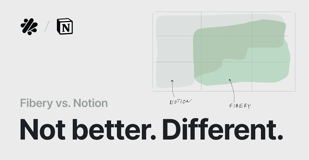
Fibery vs. ClickUp. Complex or Complicated?
Usually, posts X vs. Y are shallow. This post is not. As the Fibery CEO, I have to switch off the bias. Take this post with a grain of salt.
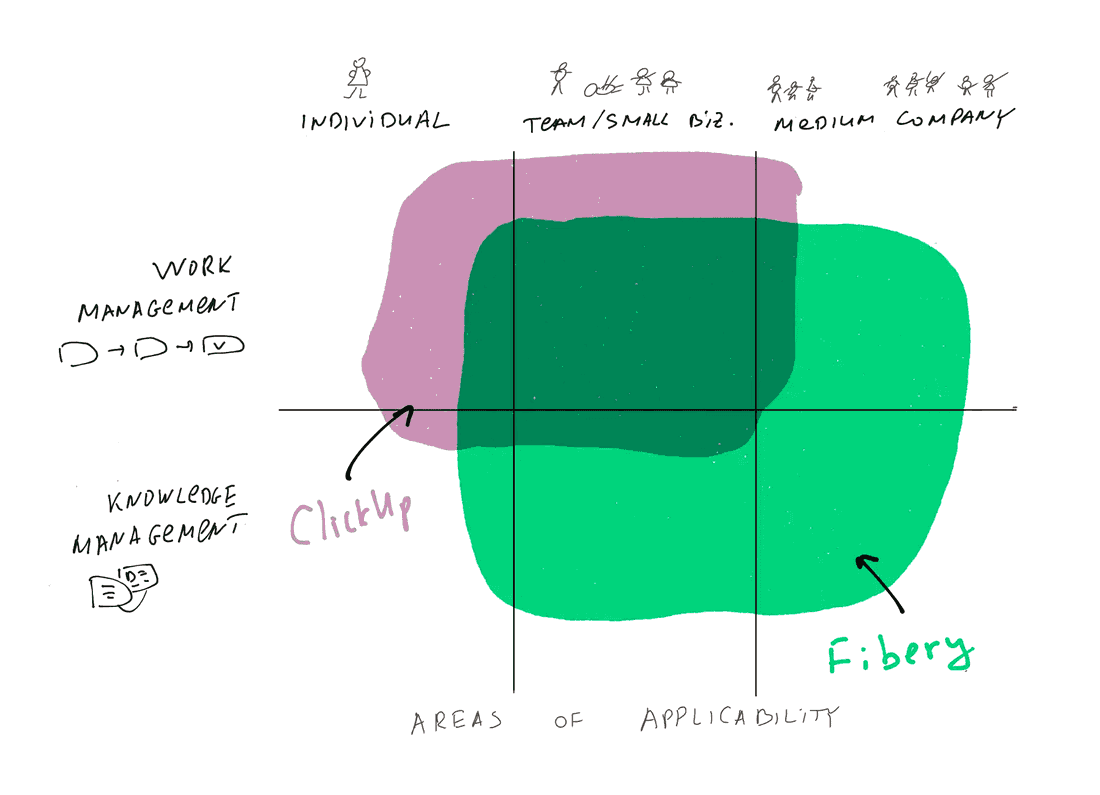
The major goal is to explain how Fibery is different and its strengths and weaknesses. ClickUp is an insanely feature-rich product. However, it’s quite complicated and has poor performance. Let’s dig into something interesting together.
Productivity Rant
I have to start with a weird promise by ClickUp since this promise pops up all the time:
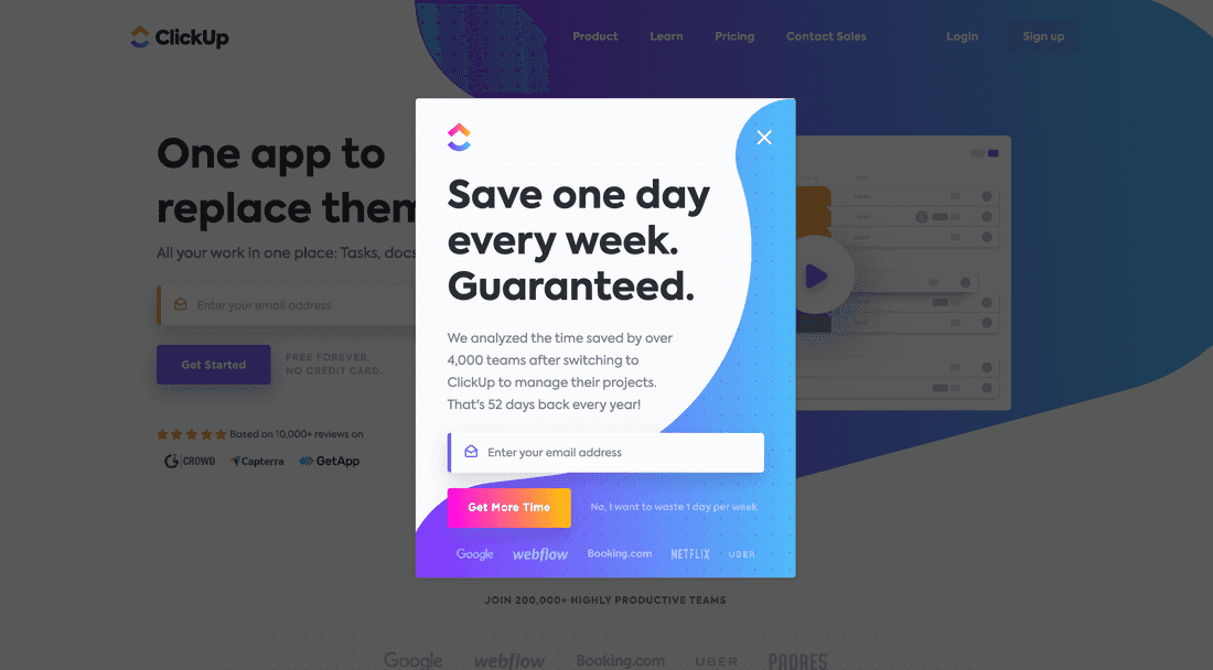
Unfortunately, this promise has no links to check, no research to verify. And my experience with productivity is very different. I know that productivity is extremely hard to measure. What is knowledge worker productivity? Time spent changing states of tasks? Time spent on time tracking? Time spent on creating new tasks? Nope.
Real knowledge worker productivity is quality and quantity of insights.
You can’t measure a programmer’s productivity using lines of code. You can’t measure lawyer productivity by the number of won cases. You can’t measure product manager productivity by a number of feature specifications. A programmer can spend a day figuring out a complex problem and fixing it with 8 lines of code. A lawyer can spend weeks on a complex case, digging into history and precedents, and then wrap it up in hours, enlightened by a sudden aha moment. A product manager can throw out 80% of features and find a genius solution that makes the product fly. All these cases are powered by insights, not mechanical productivity.
Check Augmenting Organizational Intelligence article to get more details about this intriguing topic.
Let’s be honest. ClickUp and almost all modern, similar tools (including Fibery, so far) pay little attention to insights generation and discovery. I think this “Save one day every week” is a false promise and moves our industry in the wrong direction. [The rant is over]
General feelings
ClickUp is most likely ** the most feature-rich system I’ve seen**. It has everything you can imagine: tasks, chats, email integration, forms, dashboards, integrations, automations, and 100s bells and whistles. Yes, it looks like a task-tracking tool on the surface, but it’s a complete one.
Another immediate thought is that everything is gray. There are so many low-contrast labels. I don’t like it since not all people have sharp eyes, and a gray scheme makes a tool harder to use. Font sizes are also too small in many places.
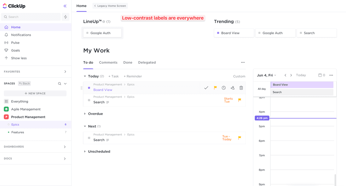
Getting started is awesome, if you check the first three videos, you will have a good understanding of how to get going. However, ClickUp has serious performance issues — and it can be noticed even during onboarding as tasks are loading for a while. I’m curious if the ClickUp 3.0 release will fix that.
Philosophy
ClickUp = Tasks
In ClickUp, everything is a Task. You have higher-level structures to organize Tasks (Spaces & Folders), but in a nutshell, every work item is a Task.
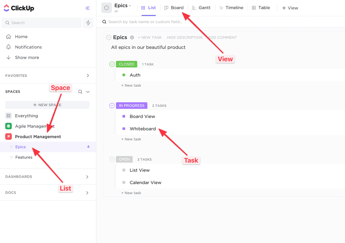
Here is an example. I’ve created a new List that contains product Epics. However, there is no custom terminology — everywhere in UI, I see Tasks. You can get used to it, but it makes interactions less streamlined. Adding a new Epic? Add a Task. Adding a new Candidate? Add a Task. Adding a new Project? Add a Task.
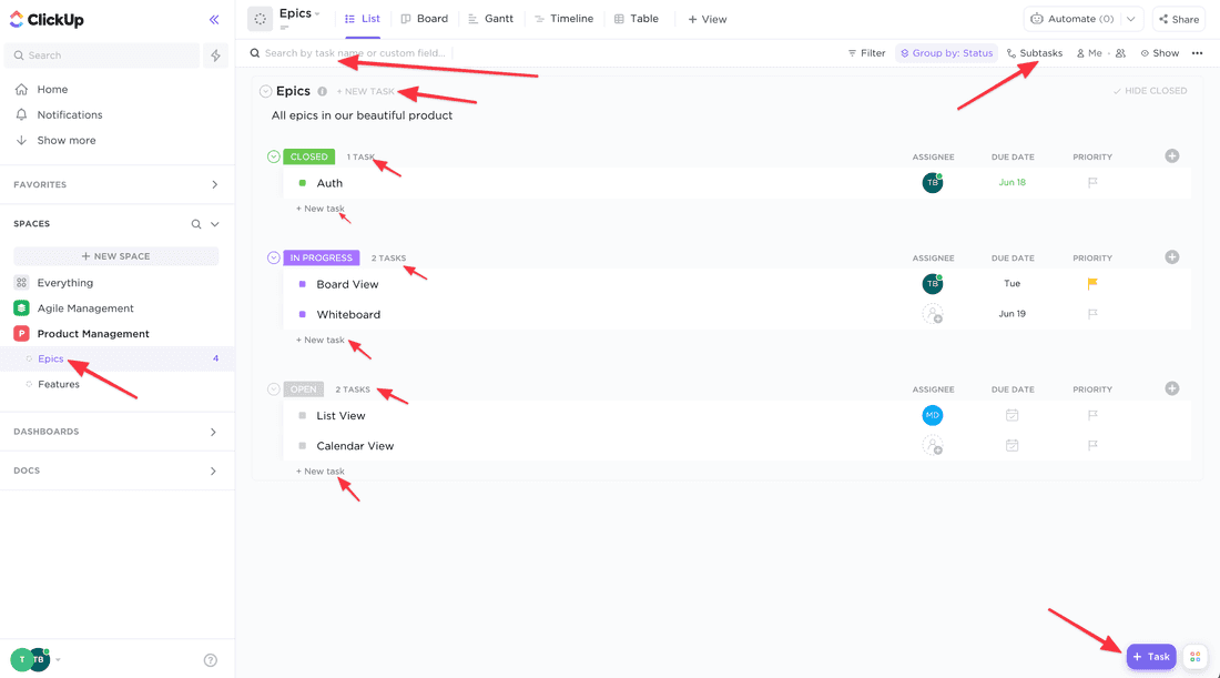
On the one side, ClickUp simplifies the user experience by hiding the database structure — and you have a very simple basic model. OK, everything is a Task, but I can create Lists, and inside these Lists, all Tasks may have different Views of the same database. For example, my Epics view may differ from the Feature view — both database entries contain the same fields, but some of them may be hidden.
🦐 On the other side, you can’t model hierarchies and processes in a nice way. It’s not possible to have a tree view that shows Epics and Features. It’s not possible to have a board that shows Features by Epics, etc. Connections and relations are not a strong part of ClickUp. For complex processes, you will have to live with many workarounds and suffer from a lack of good abstractions.
Fibery = Set of connected Spaces
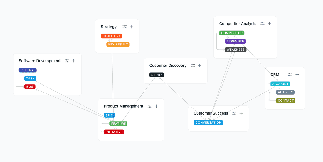
In Fibery everything is connected. The main building blocks are Space, Database, Relation, and View. Here is an example of a connected workspace for a startup.
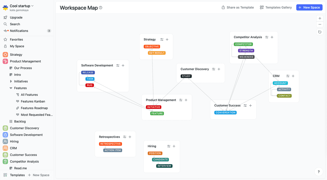
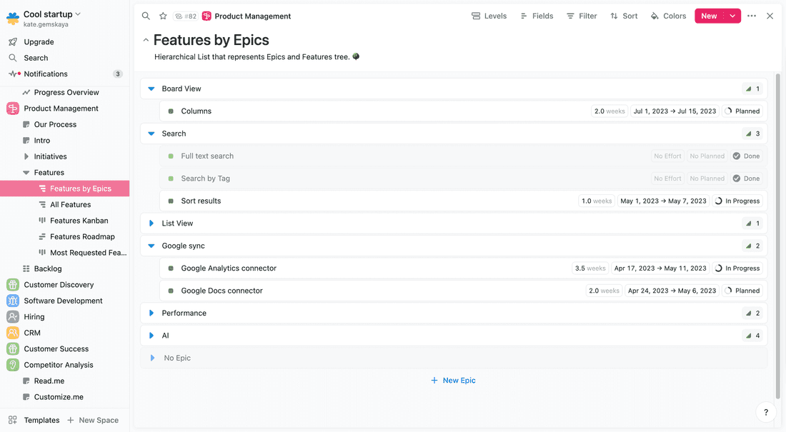
Note that Databases can represent hierarchy (Epic → Feature) and such structures are more natural to work with than just Tasks. Adding a new Epic? Add an Epic. Adding a new Candidate? Add a Candidate. Fibery represents your custom team terminology and adapts to your process.
Translation sheet (as close as it can get)
ClickUp   —   Fibery

Workspace —   Workspace
Space     —   Space
List      —   Folder
Task      —   Database with Entities
Field     —   Field
View      —   View
Let’s create a space
We’ll try to create a basic process in both tools. Let’s take a simple Product Management process with Epics and Features. Epics are huge requirements that break down into smaller requirements (Features).
Our main cases here are:
- Create a hierarchical product backlog
- Write features specifications
- Create product roadmap
- Split features to user stories and track execution
💪 Note: in Fibery, you can create a space within minutes using a simple AI prompt like “I need a Product Management space with Epics and Features”. It will not be perfect and probably require some tweaks, but it will speed up setting up a LOT. Below I am reviewing a step-by-step manual space creation.
In ClickUp, I created a Product Management Space and two Lists for Epics and Features. Epics and Features are connected via a relation, so you can link several Features to an Epic.
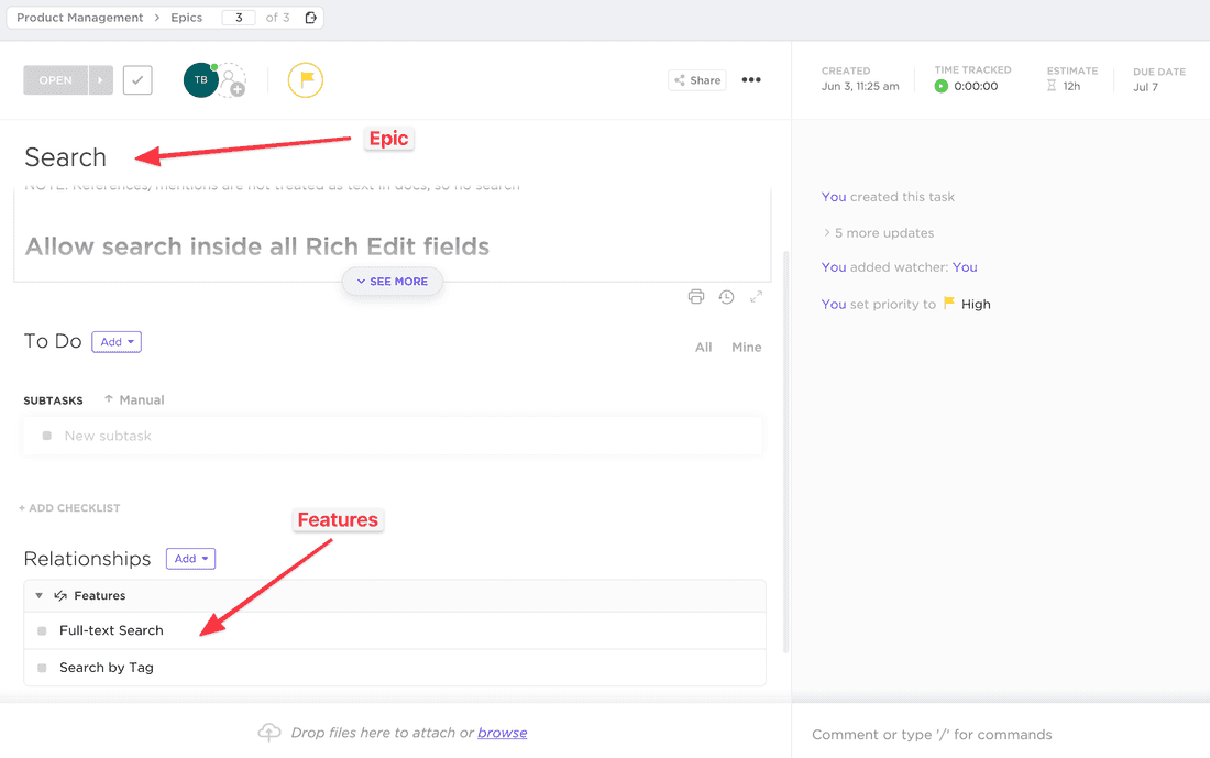
🦐 Unfortunately, relations in ClickUp are very basic. You can just add them and see them in a Task. You can’t use them as lanes on boards, as groups in lists, access in filters, and formulas. Relations are always many-to-many, and all that leads to poor product hierarchies. It’s not possible to have a hierarchical backlog, and you will have to manage Epics and Features from different Views.
Views in ClickUp are very good. Board, Table, Timeline, List — all views are there, and they are feature-rich:
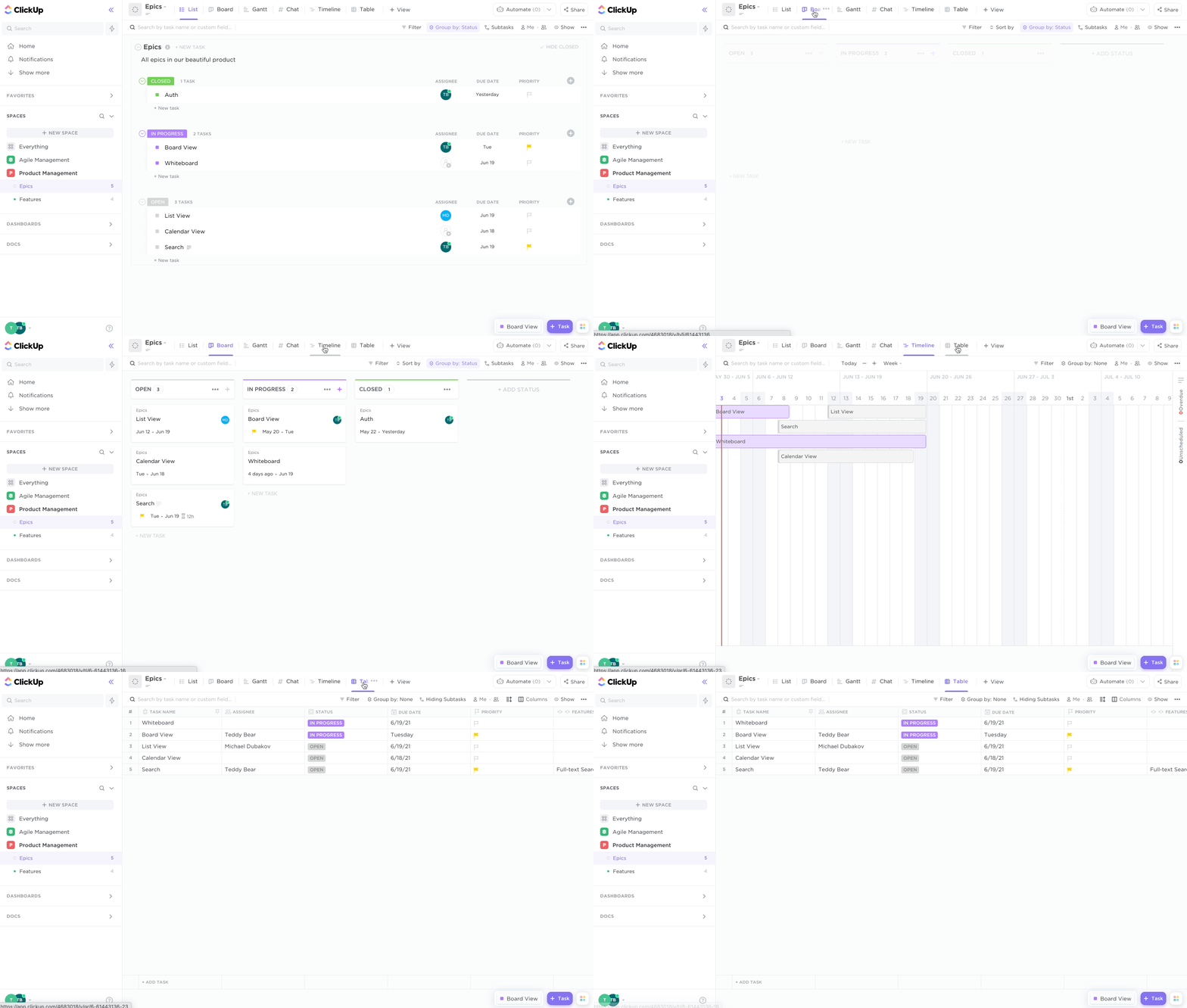
ClickUp. Navigating all views in the Product Tracking space.
In Fibery, setup is as easy as in ClickUp. You just add new Databases, connect them via Relation and create several Views to see all relevant information:
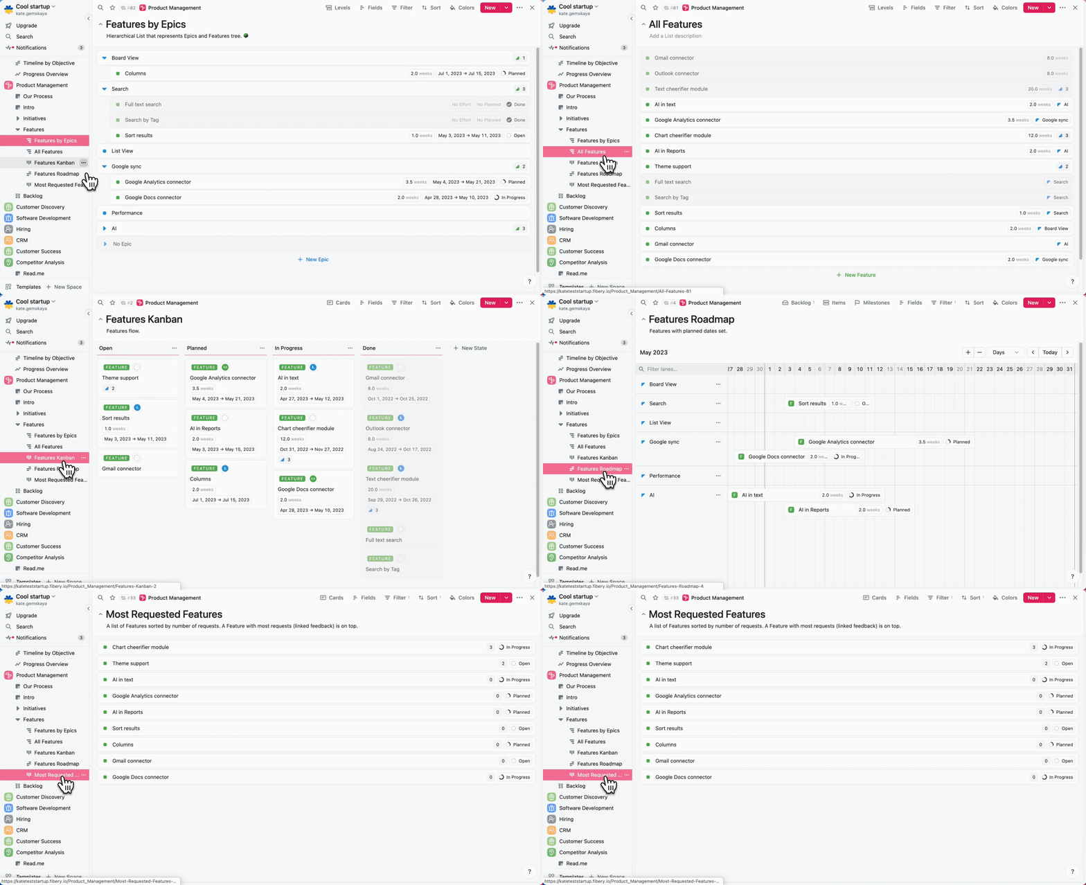
Fibery. Navigating all views in Product Management space.
💪 Note that Fibery has no restrictions with relations, so you can create a hierarchical backlog, group features by epics when required, and connect things better.
Ready to Give Fibery a Try? 🥹
Btw it adapts to your team and grows with it.
Create hierarchical product backlog
🦐 In ClickUp hierarchies are hard. You can’t quickly create Epic and its Features. You have to add an Epic, open the Epic, and add Features from there. It is quite slow:
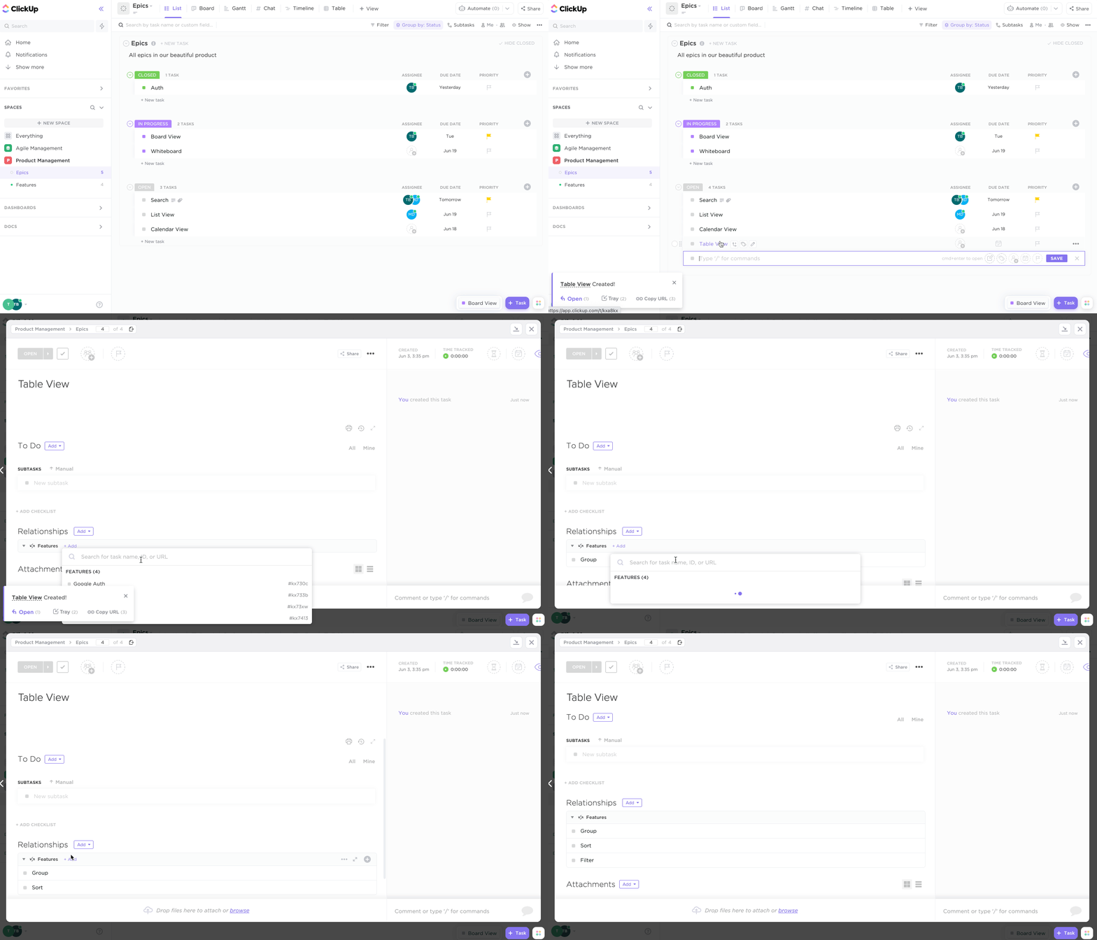
Adding an Epic and several Features in ClickUp.
💪 In Fibery, hierarchies are easy. You can add Epics and Features from a single View:
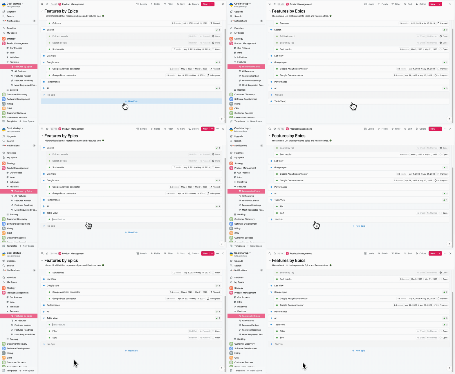
Adding an Epic and several Features in Fibery.
Epics/Features specification
Now I want to create a specification for an Epic. Usually, it’s just a document with some images.
💪 ClickUp has a rich text editor where you can do many things. And you can do this right inside a Task. This is good, many tools miss this opportunity to unite a specification and work on an item.
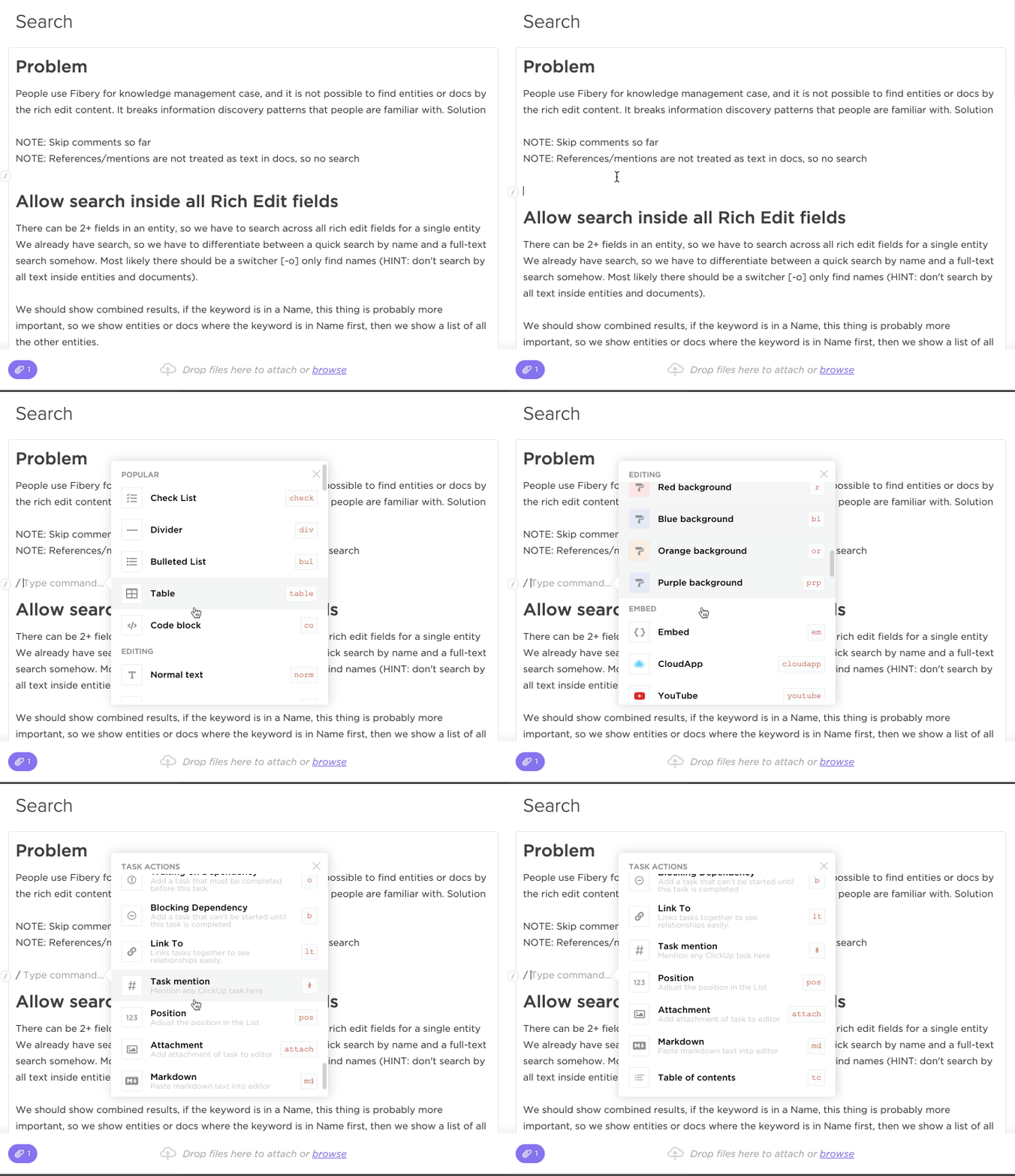
Rich editor in ClickUp is collaborative and, well, rich.
The only missing piece is inline comments. It’s hard to discuss specifications with a single comments thread since you loose context.
In Fibery, there are many formatting options but fewer embeds. You can write decent specifications as well, all important things are there.
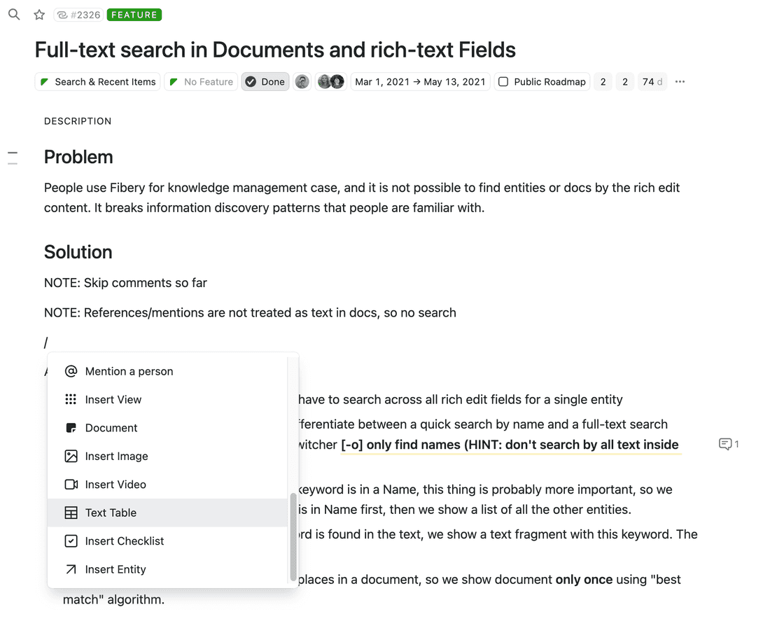
💪 In Fibery, you can also call a chat-like AI Assistant to help you work on your specs (and any other Task or Doc). You can create your custom prompts for frequent cases (“Summarize”, “Brainstorm solutions”, etc) to speed up your work.
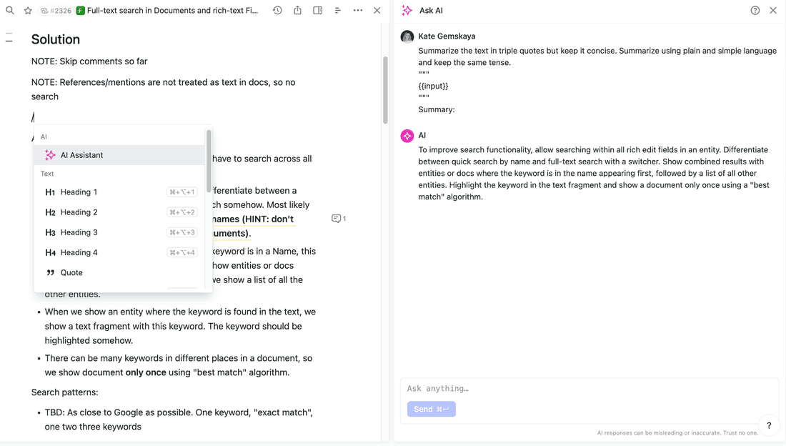
ClickUp also plans to introduce AI Assistant as a part of ClickUp 3.0. However, they’ve been postponing the release for a while now and it’s not clear when it will happen.
Create product roadmap
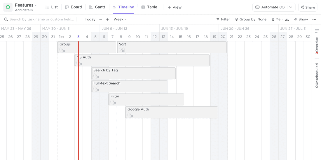
In ClickUp, Timeline View is decent, and you can create features roadmap, drag and drop features from the backlog, color code features, and filter them.
In Fibery, it is also possible to do the same things. Additionally, the Timeline View can be grouped by Epics, making it easier to see what is happening.
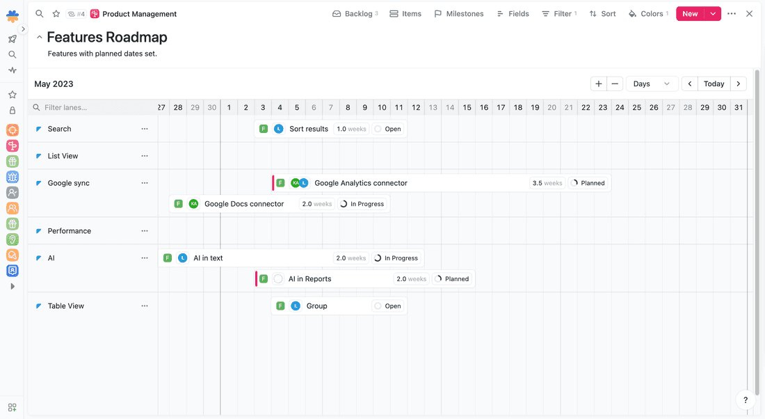
To sum up, I’d say ClickUp provides a good experience for space creation and usage, but a lack of relations makes everything less intuitive and harder to work with in the future.
Building Blocks
ClickUp is a platform, let’s review all building blocks.
Information organization
In ClickUp, you have Spaces, Folders, and Lists to organize information (Space → Folder → List). Space can be a department, Folder can be a team, and List can be a type of task or a specific phase of tasks. This structure is generic and quite flexible since you can assign permissions to Spaces, Folders, and Lists, thus controlling visibility and access level.
💪 In Fibery, you have just Spaces and Databases. Databases can form hierarchies, so you may have Department → Team → Features structure just from Databases.
Also, there is no depth restriction or cross-reference restriction. Let’s say you have two hierarchies: Department → Team and Portfolio → Project. You can assign a Tasks to a Team and a Project and see these Tasks in both hierarchies. In ClickUp, this is not possible.
🦐 However, permissions in Fibery are per-Space only, so it’s harder to hide some information from other people. We are already working on Entity Level permissions — it is unclear when we will deliver anything, but we will try to progress in this area as deeply as we can. ClickUp’s permissions are more advanced as of now.
Fields
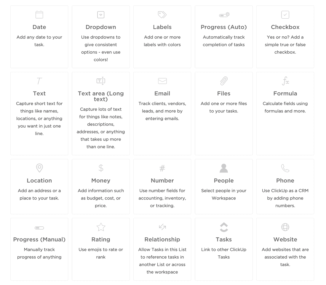
ClickUp has all possible (it seems) types of fields.
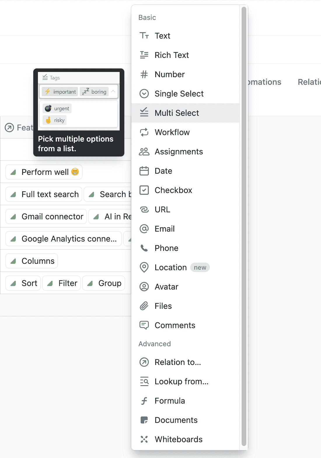
Fibery also has many fields, from Location and Phone to Checkbox and Multi Select. Probably, only the Rating field is missing.
Relations
Relations are the most underestimated thing in almost all productivity tools. I wonder why. Connections in our brain are super-important, all our knowledge lives in these connections. Why should the information be different? I have no idea.
No vendors get relations right. Relations are weak in ClickUp, Notion, Coda, Asana, Monday, and Airtable. Airtable is close, but there are no relations between bases.
🦐 As you can already guess, Relations are very basic in ClickUp, so you can’t build hierarchies, cross-processes Views, and naturally reflect company structure.
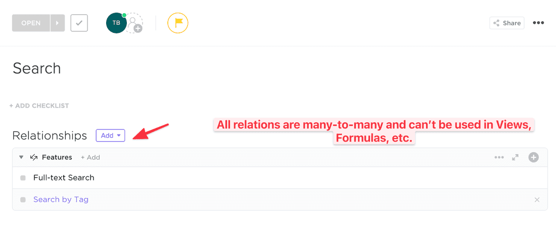
Bi-directional links are also there, but they are just links without any context. When you mention some task, a backlink is added to the Relations section.
💪 In Fibery, relations are first-class citizens. You can create complex structures and use relations to visualize information, calculate formulas, build charts, etc.
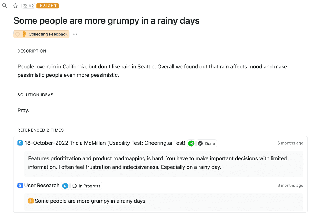
Bi-directional links are more powerful as well. You can highlight any text and link it to any entity, thus adding context to the link and helping generate insights:
Formulas
In ClickUp, formulas are quite powerful, but you can only use fields from a single Task. It’s understandable since there are no true relations. As a result, the usefulness of formulas is somewhat limited. However, you can calculate something on a Dashboard, which feels like a workaround but is still helpful.
💪 In Fibery, formulas work across the whole hierarchy, so you can access fields of related entities, calculate values of collections, etc. For example, you can calculate the sum of Effort of all not completed Features:
Features.Filter(State.Final != true).Sum(Effort)
Views
💪 ClickUp has many views. I think in terms of Views, it’s the richest tool on the market. Here is the full list: List, Board, Calendar, Box, Timeline, Gantt, Workload, Mindmap, Table, Map, Form.
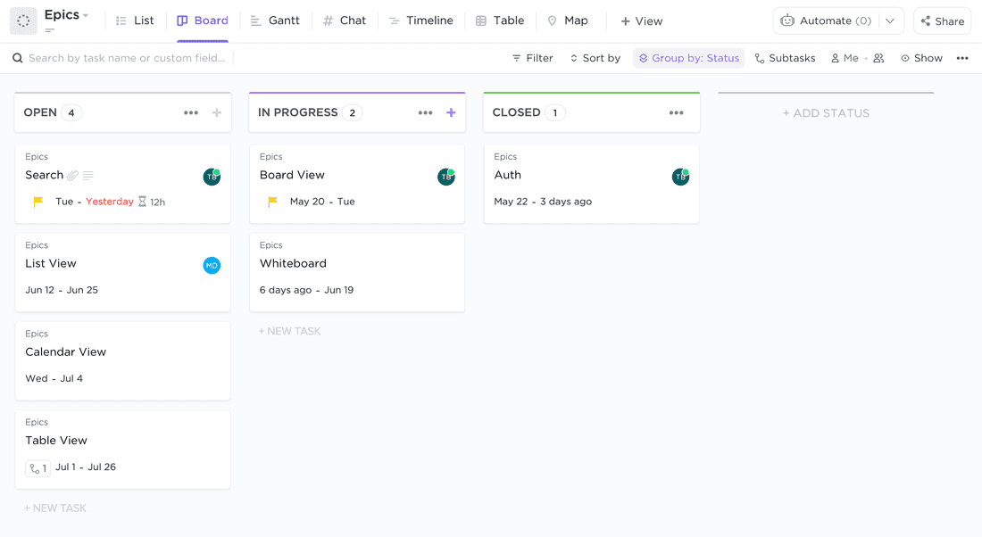
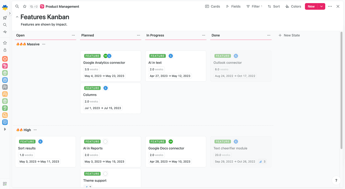
Fibery has almost the same views: List, Board, Calendar, Timeline, Whiteboard, Table, Form, Map. Some views are more powerful. For example, List can represent deep hierarchies, Board can have horizontal lanes, Whiteboard is much more flexible and feature-rich.
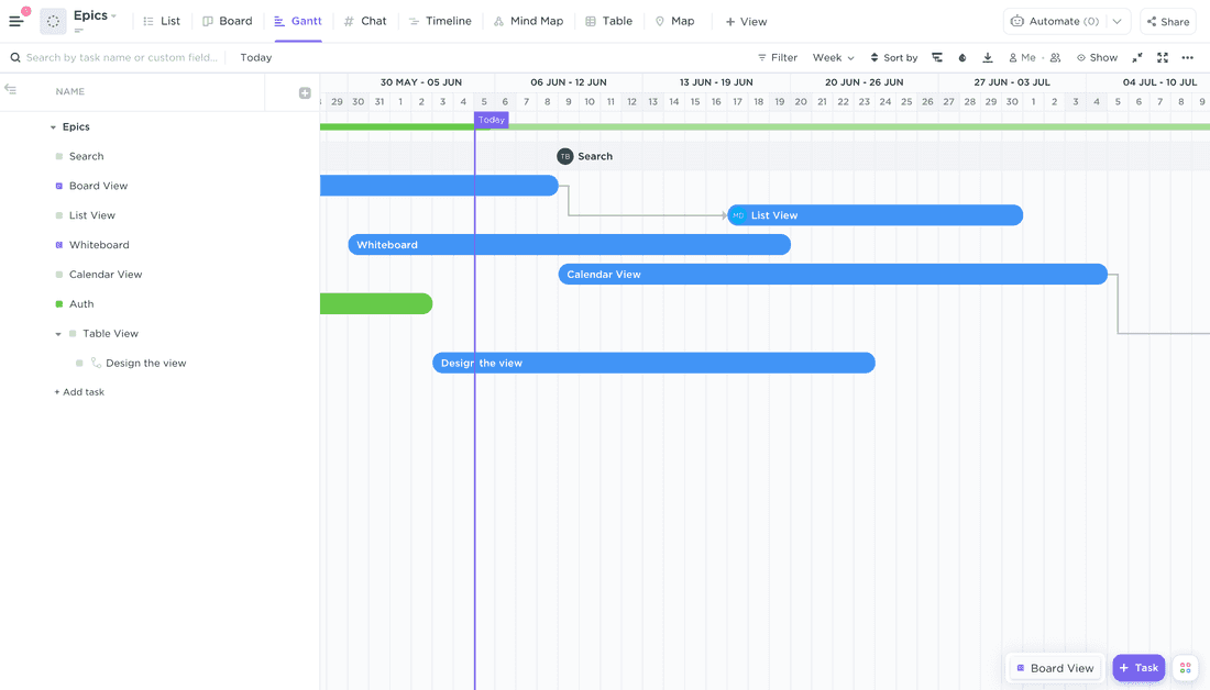
ClickUp unique Views
Gantt Chart in ClickUp is pretty nice. You can visualize tasks and sub-tasks, create dependencies on the fly and control the critical path.
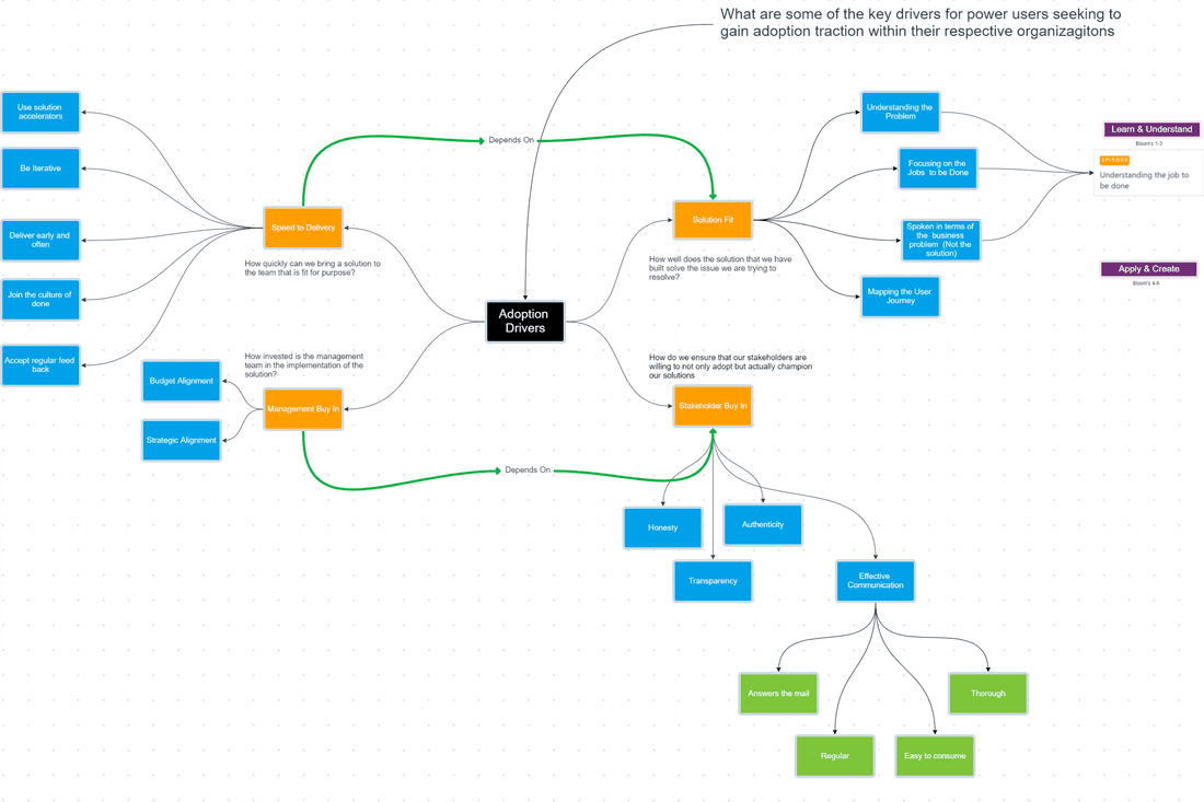
Fibery unique Views
Whiteboard in Fibery is a flexible view to create various diagrams and mind maps (in ClickUp, you can just create mind maps).
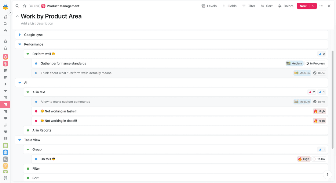
Hierarchical List visualizes unlimited levels of hierarchy. For example, here we can see a Product Area with all its Features, Tasks, and Bugs.
Reports & Charts
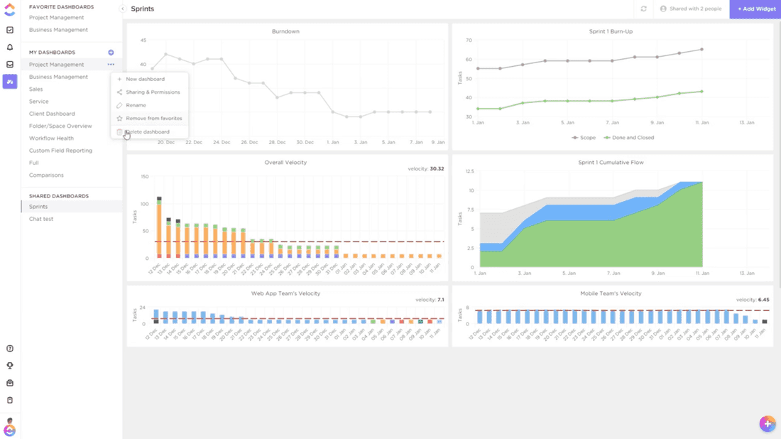
💪 ClickUp has decent Dashboards to visualize various information. There are many widgets, including charts, metrics, tables, etc. It is quite extensive, but the approach is complicated — there is no unified mechanism to create a chart, so you have to learn where to find all the charts and customize them for your needs.
💪 Fibery has very powerful charts with a Tableau-like experience. You can visualize almost anything.
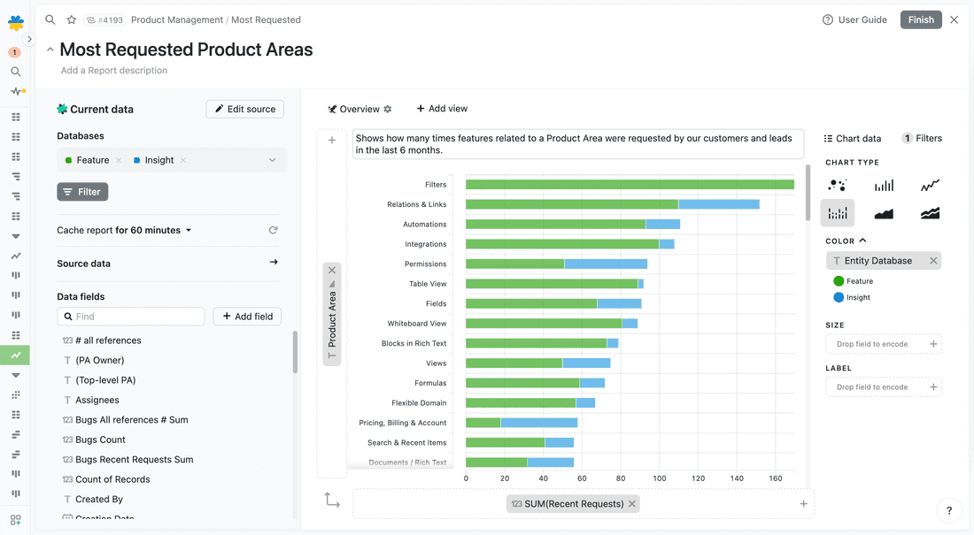
🦐 However, there are no Dashboards in Fibery, and you have to browse charts one by one, and this is not very convenient.
Automations
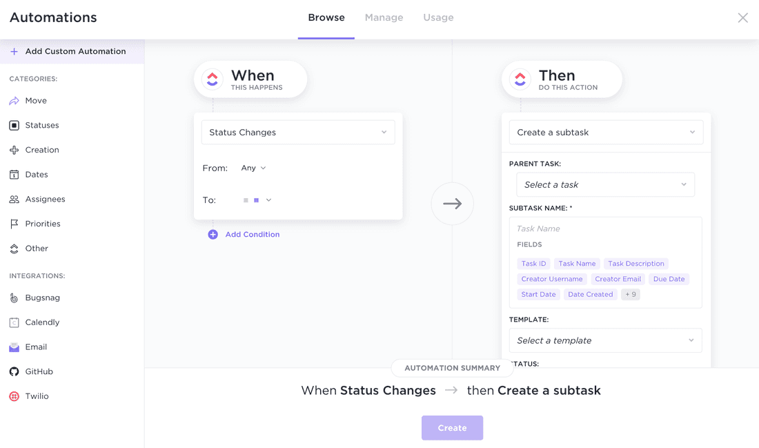
In ClickUp, you can automate things via Automations in a List. It’s nice and easy. You can also execute actions in external systems, like creating an Issue in GitHub or sending an Email.
In Fibery, you can also automate things by adding Automatic Rules for Databases. Setup is very easy as well:
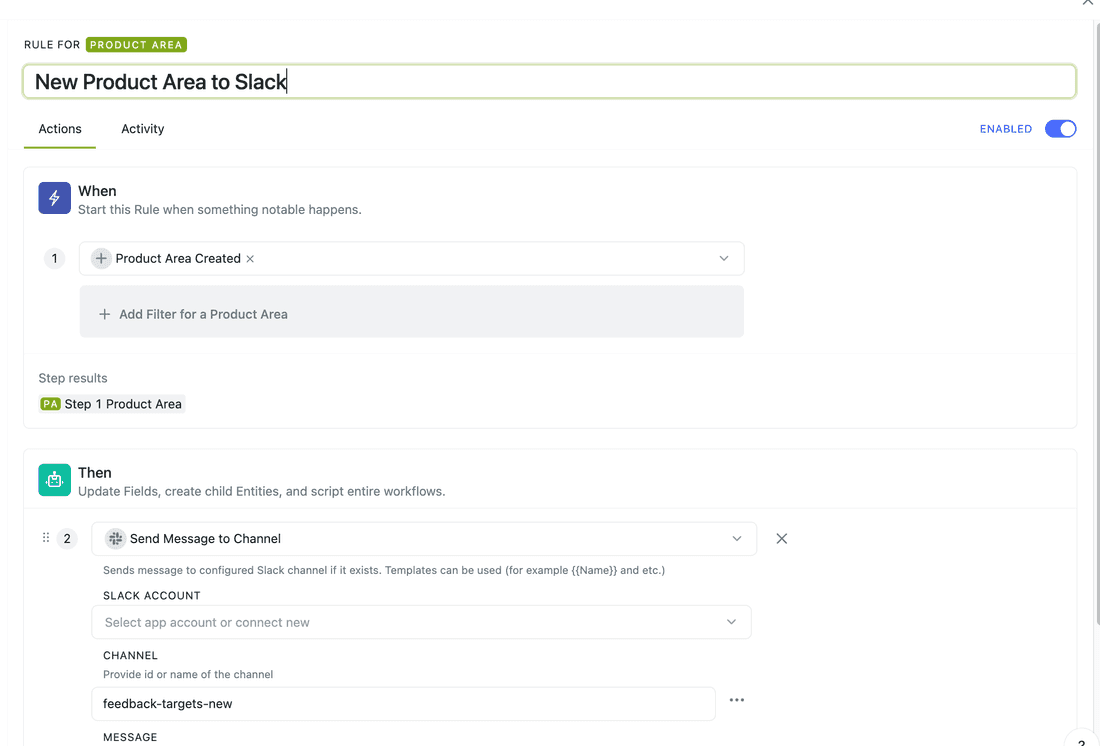
💪 In Fibery, you can also use AI in Automations and call AI to do things like automatic summarisation or information extraction.
Action Buttons
💪 Fibery has Action Buttons, custom actions that you can execute manually. It might be handy if you want to do something, but there is no exact rule to describe when :) For example, here is the action that closes a User Story with all its Bugs and assigns the User Story to the logged user:
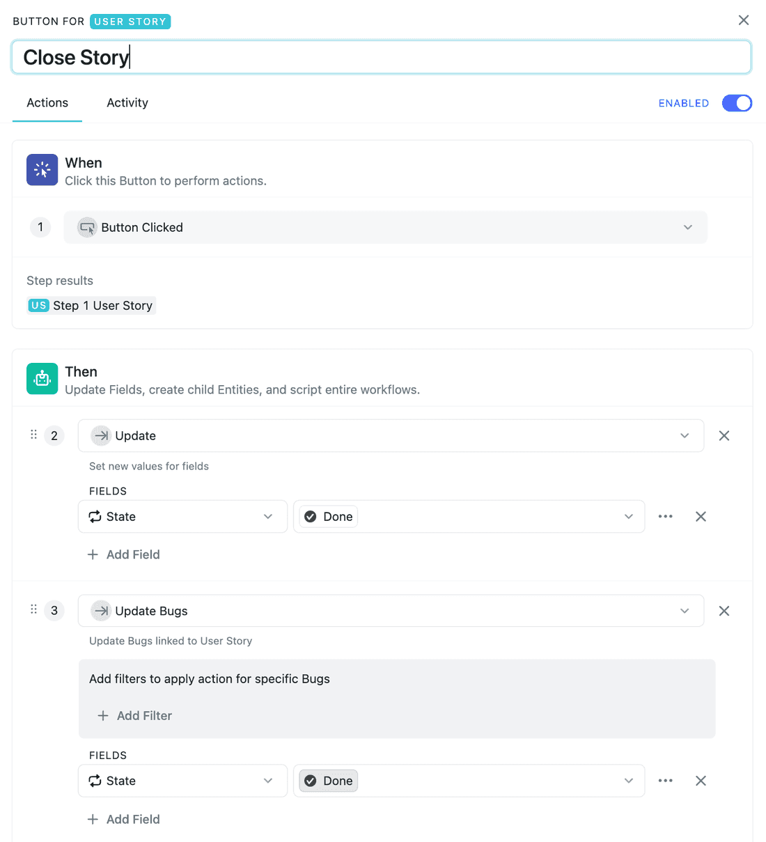
And here is how you can execute an Action Button from any User Story:
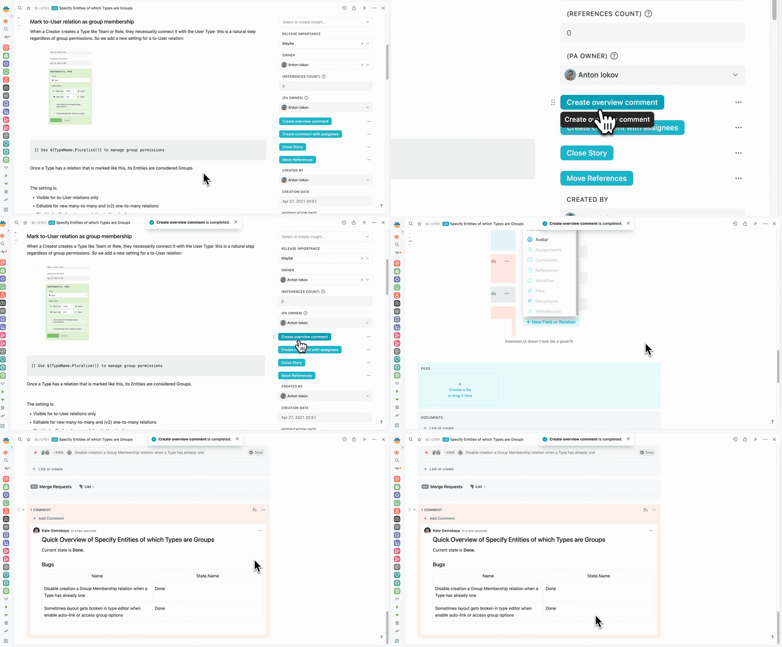
Action Button execution in Fibery.
AI tools
ClickUp has recently started to roll out its AI Assistant (as a part of ClickUp 3.0 release) that helps to write, edit, and generate some ideas. Basically, this is what almost all AI Assistants are doing right now, but it is still useful. There are 100+ prompts that are pre-setup for different departments and no possibility to create your own prompt templates (for now?). All users on Paid plans can access ClickUp AI at the fixed cost of $5 per member per month and it’s not available for the Free users.
💪 Fibery has several powerful AI tools and a unique vision for how AI will change your work patterns. All users (Free and Paid) can access the Fibery AI features at a fair cost by connecting their OpenAI token. The cost will depend on the quantity of use, we estimate that it will cost ~$2-4 per month per user with VERY heavy usage. Users also have 200 free prompts to try Fibery AI out.
Here is a brief overview of the Fibery AI tools:
Automatic space creation
💪 Enter a short prompt (like “Personal CRM” or “Product Management for a Startup”) and Fibery AI will create a customized space that meets your requirements. It saves a lot of time and allows you to easily experiment with your process.
As a result, you will have a new space with databases, relations, fields, views, and even an overview document in 1-2 minutes.
Create Your 1st Fibery Space with AI 👽
Btw it adapts to your team and grows with it.
Text AI Assistant
Fibery AI Assistant is not unique, but it does have some cool details that make it more powerful than ClickUp’s:
- Chat-like interface mixed with our unique panel navigation helps to iterate and get what you want faster.
- You can create your own private commands that nobody sees, or create public commands that all people will see and use.
- You can use database fields in your commands and create clever command templates.
AI + Automations
You can call Fibery AI in Automations (both Rules and Buttons) to do repetitive things for you. You can use it for many cases, like:
- Automatically summarize Intercom conversations and create Feed View to read them.
- Calculate sentiment score for all intercom chats and spot problematic conversations.
- Extract Country, Zip Code, and Address from some text and fill fields for Contact.
API & Integrations
ClickUp has four dozen native integrations. I’d say all the most popular systems are there. Integrations are very different, and there is no common pattern, ClickUp tries to support the most popular cases for every system.
💪 Fibery has a different approach to integrations. Fibery has a flexible domain. Fibery integration app replicates a domain of any external tool and fetches all required data. Then you can connect this data with Fibery entities and use it as usual Fibery data (Create charts, create Views, add formulas, etc.). It’s a very powerful approach since it unfolds many useful cases:
- Calculate real MRR for your Accounts (fetch Invoices from Braintree and link them to Accounts via relations)
- Attach all feedback from Intercom to Features (fetch Intercom chats and use bi-directional links)
- Attach all tasks from Jira to Features (fetch Jira tasks and link them to Features via relations)
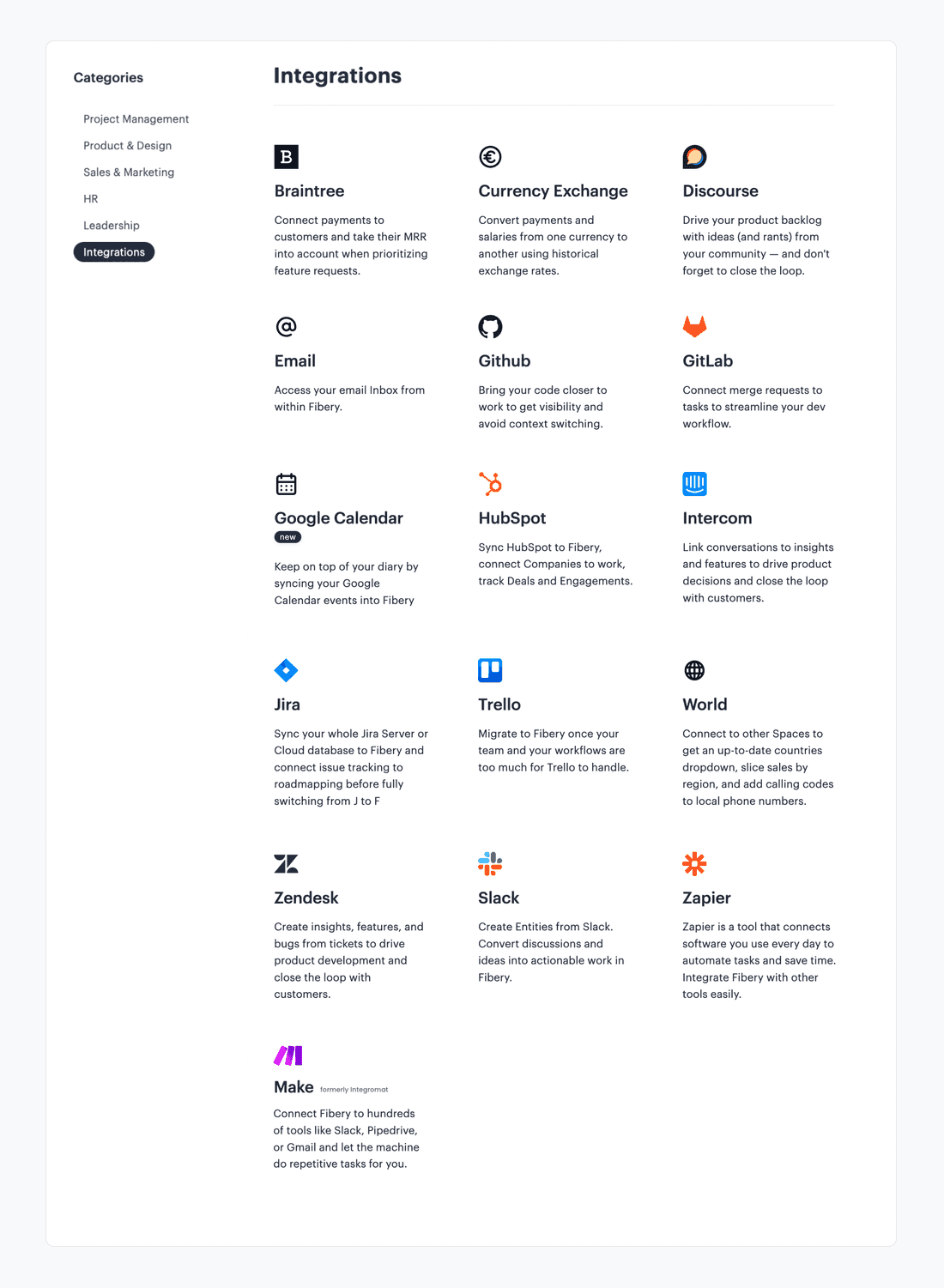
However, data sync is one-way for most of the integrations (except Jira). For example, you can’t change the status of Trello tasks from Fibery.
Both tools have a decent API, but Fibery has GraphQL API on top.
🫢 Btw, we have a neat ClickUp integration and a powerful one-way ClickUp import too.
Public sharing
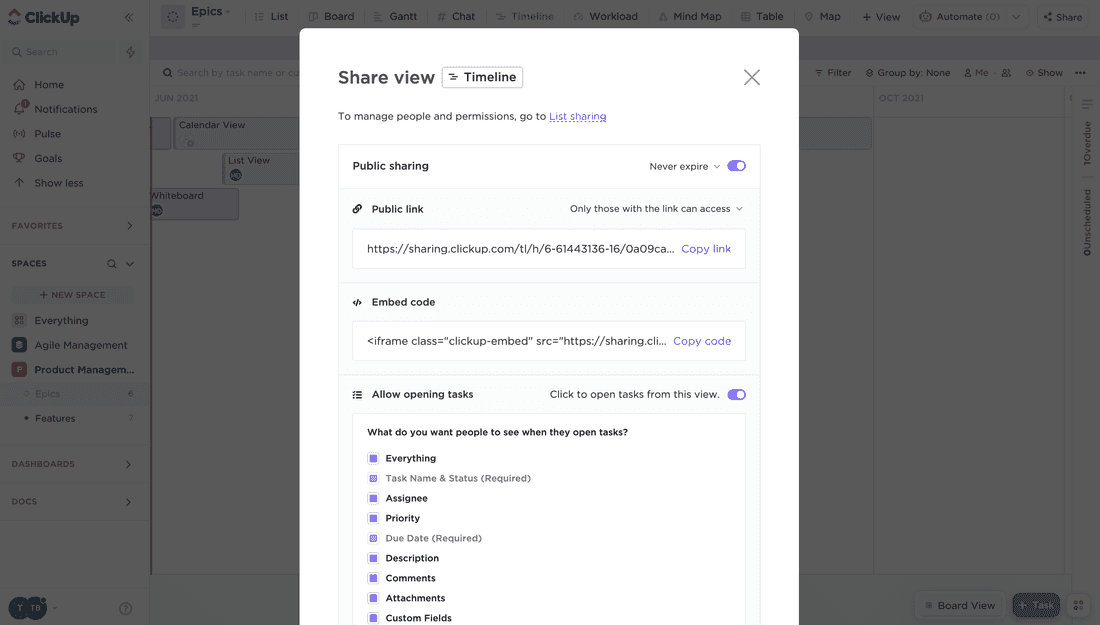
💪 Sharing is very flexible in ClickUp. You can share any View or any Task and even select fields to be shared:
In Fibery, you can share Documents, Entities (like Task, Feature, or Project), Charts, and Tables. You can also share your whole Space or Workspace. It is not possible to share some Views (like Timeline).
Performance & stability
🦐 ClickUp has had poor platform stability and performance issues for the past two years. You can find hundreds of complaints about outages, data losses, and slow systems with tasks loading for several minutes. The situation is indeed quite bad, here is just one comment: “people’s entire workdays are ground to a halt because tasks don’t load…“. Check out this Reddit thread for more. ClickUp hopes to fix these issues with the ClickUp 3.0 release, but the due date is not clear.
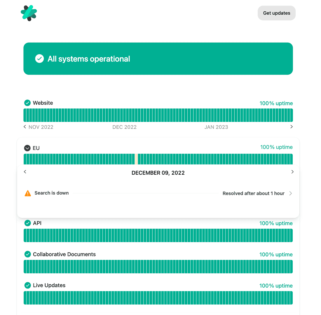
Interestingly, ClickUp is hiding its status history and showing only updates for the last week.
In Fibery, performance and stability are given, and we have nothing to hide. You can check the status updates for the last year and a half.
Pricing
Both Fibery and ClickUp are free for personal use. The highest priced ClickUp plan costs $29, and Fibery — $20 per month per user.
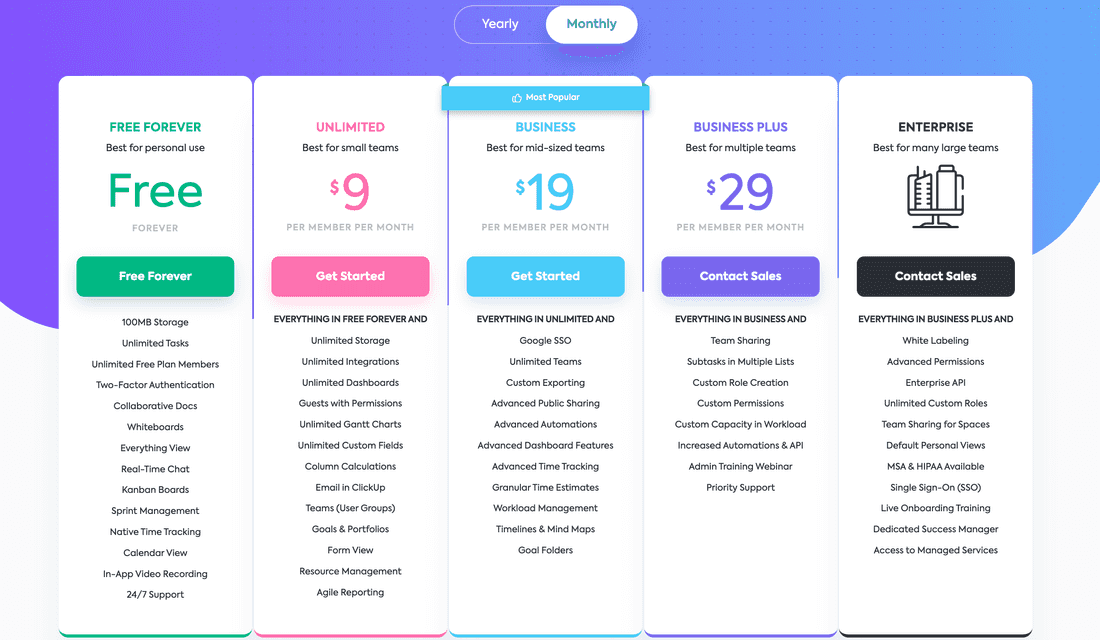
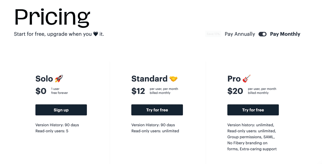
Unlike in ClickUp, in Fibery most features are included into any plan.
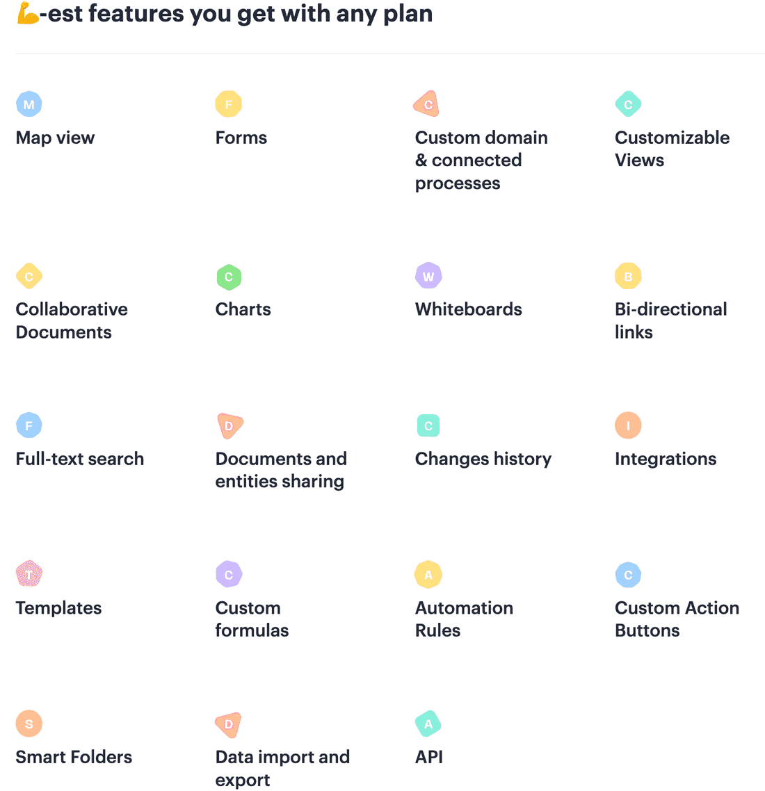
💪 In Fibery, we also offer a free year for startups with ARR < then ours and discounts for nonprofits and educational organizations.
Summary
Complicated vs. Complex
👆 Process management is a complex problem, it can’t be solved successfully using complicated approaches. You have to embrace complexity and build a complex product.
A car is complicated while traffic is complex.
Here is the list of simple, complicated, and complex systems properties:
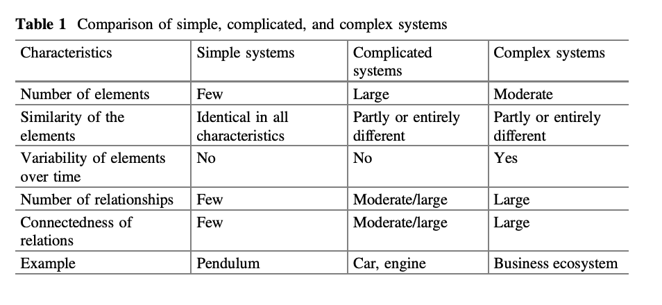
Three main properties of a complex system that we care about are:
- Moderate number of elements
- Elements variability over time is huge
- Number of relations is large and connectedness is large
It means that a tool designed for complex process should have fewer building blocks (elements), it should be able to evolve and it should connects elements together and works with connections well.
- ClickUp does not follow these rules. It has too many elements, it can evolve, but relations and connections are weak.
- Fibery does follow these rules. It has fewer elements, it can evolve and relations are first-class citizens.
😈 ClickUp
ClickUp is a very powerful tool that can cover many processes. It’s an all-in-one platform for the whole company indeed. However, it is a disconnected all-in-one platform. The lack of relations between Spaces makes it much weaker than it could be. ClickUp will have trouble scaling with the company’s growth since Spaces/Folders and Tasks are not enough to represent the complexity of a medium/large organization.
ClickUp has zero innovative features, all of them were seen in other tools. But ClickUp combined them nicely and created a complete productivity space for teams and small companies. Asana and Monday are older but less complete and much slower (already!). I’d say Monday is the closest vendor to ClickUp in terms of spirit and approach, but I think ClickUp will win the competition here. However, it seems like ClickUp needs to fix VERY poor performance and stop over-promising things.
ClickUp is designed as a complicated product. It adds all possible features into a single suite, but abstractions are not ideal in many cases (charts & dashboard widgets, integrations, tasks/sub-tasks, docs/rich-edit field, goals — all these things can be streamlined and collapsed into unified solutions). Relations and connections are very basic and can’t support complex structures.
ClickUp looks quite easy to grasp and start working in. However, complicatedness will impede the company processes evolution and tool growth.
🐉 Fibery
Fibery has the best long-term approach for information organization and can connect many processes due to powerful relations. In Fibery, you can create deep hierarchies, connect processes, visualize cross-process data from different angles, and reflect the structure of any organisation as precisely as possible in theory.
Fibery has a way better basis to scale, but lacks some smaller productivity features. It’s hard to choose Fibery if you compare it with ClickUp feature-wise. But if you believe in connected organizations, then Fibery will shine.
Fibery is designed as a complex product. It has fewer abstractions and tries to unify things. It has rich relations and back-links functionality. It leads to a slower start and a higher entry barrier. However, Fibery will help you create deep and powerful processes and support your organization’s growth.
And the performance is great. But, as said, in Fibery, it’s a given.
Fibery
---
🦐 Not so easy to start, but AI space creation is coming the rescue
💪 Flexible information organization
💪 Hierarchies are deep and easy
💪 Relations are powerful
🦐 Not so flexible permissions
🦐 Lack of some small productivity features
💪 Whiteboard View
💪 Hierarchical List
💪 Powerful charts
💪 Custom Actions
💪 Powerful integrations that fetch all data
💪 Fibery AI has powerful use cases
🦐 No mobile apps
💪 GraphQL API
💪 Great performance
💪 Fibery is designed for complex problem


ClickUp
---
💪 Easy to start. Tasks and Lists are easy to grasp.
🦐 Limited information organization capabilities
🦐 Hierarchies are impossible to create
🦐 Relations are very basic and incomplete
💪 Flexible permissions
💪 Many small productivity features
🦐 Limited formulas power
💪 Rich Edit is feature-rich
💪 Gantt View
💪 Dashboards
💪 Flexible sharing
💪 Mobile apps
🦐 Poor performance and overall product stability
🦐 ClickUp is designed for complicated problemsPsst... Wanna try Fibery? 👀
Infinitely flexible product discovery & development platform.
